PARENT/CHILD ROOM GROUPINGS CASE STUDY
Project overview
I led the Hotels team in optimizing the room selection experience across Rocket Travel sites. Rocket Travel by Agoda is an online travel agency specializing in building customized white label booking platforms for its many enterprise-level partners and their customers. The objective was to simplify room selection so users could make it to checkout more efficiently with as little friction as possible.
PROBLEM
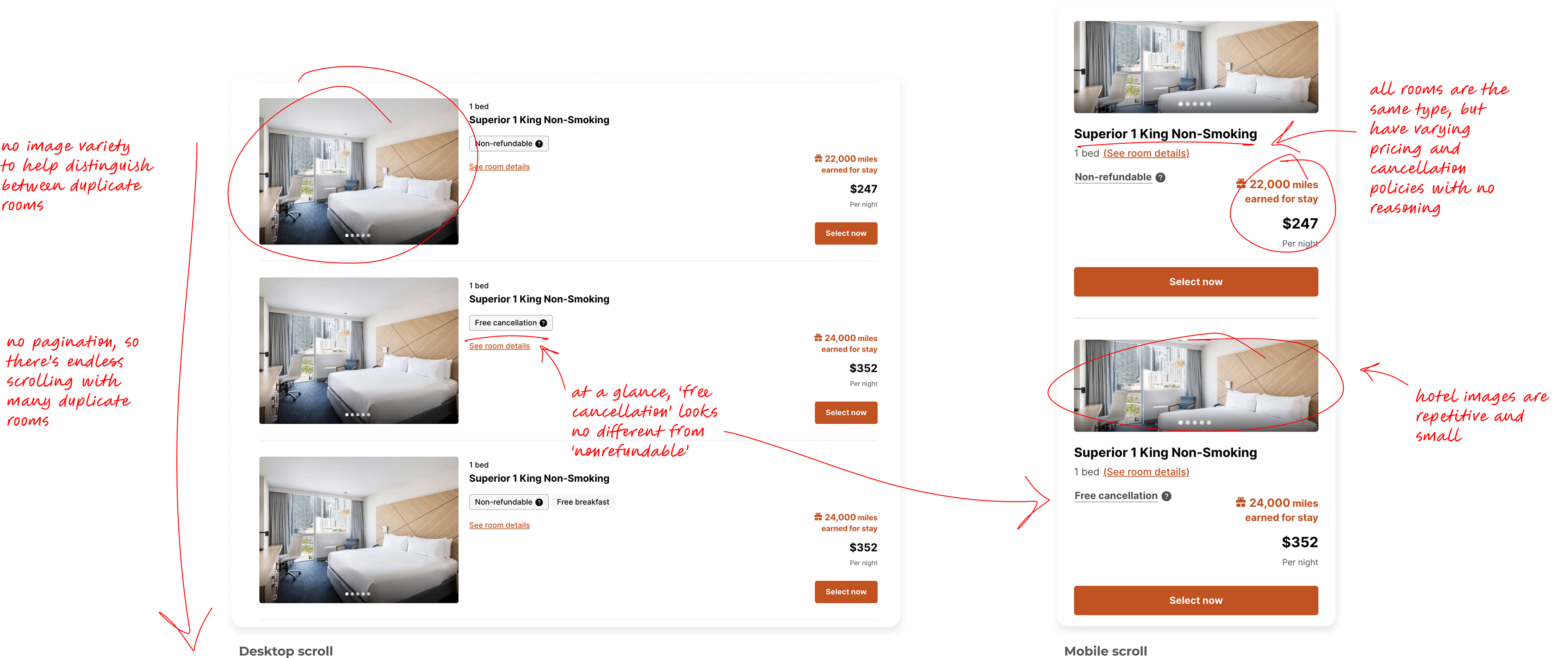
For both earn and redemption, the hotels details page was an infinite list of duplicate room offerings that differed in price, but had little to no distinction between room types, imagery or features. Users were frustrated and overwhelmed, resulting in abandonment.
For both earn and redemption, the hotels details page was an infinite list of duplicate room offerings that differed in price, but had little to no distinction between room types, imagery or features. Users were frustrated and overwhelmed, resulting in abandonment.
SOLUTION
Based on user feedback, my team and I focused on addressing 2 key issues: nesting “child” rooms within “parent” room categories, easing cognitive load, and introducing pagination, to reduce scroll fatigue. These changes increased conversion and TTM, thus demonstrating an improvement in UX.
Based on user feedback, my team and I focused on addressing 2 key issues: nesting “child” rooms within “parent” room categories, easing cognitive load, and introducing pagination, to reduce scroll fatigue. These changes increased conversion and TTM, thus demonstrating an improvement in UX.
ROLE
Experience Designer
TEAM
1 Product Owner, a small group of developers, 2 designer for occasional support, 1 Design mentor
IMPACT
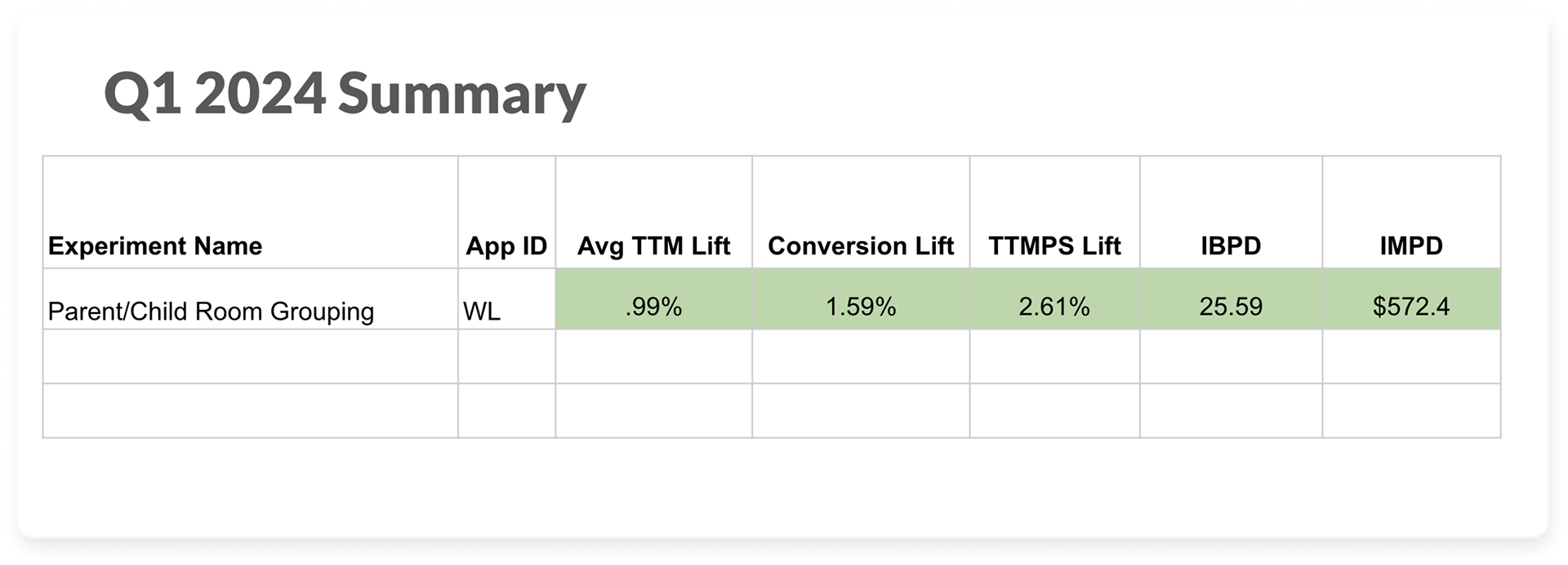
📈 1.59% increase in overall Conversion
📈 2.6% lift in Total True Margin across multiple white label partners
PROCESS
Discovery, User Interviews, Ideation, UX Design, Interaction Design, A/B Testing, Dev hand-off
DURATION
2022-2024
STATUS
Live
By implementing room groupings, conversion increased by 1.59% across all white label partners we tested on. Customers also booked more expensive rooms and tacked on extras to their purchase, resulting in a 2.61% lift in Total True Margin, earning an average of $572 in Incremental Margin Per Day.
Discovery
THE PROBLEM WITH ENDLESS SCROLLING
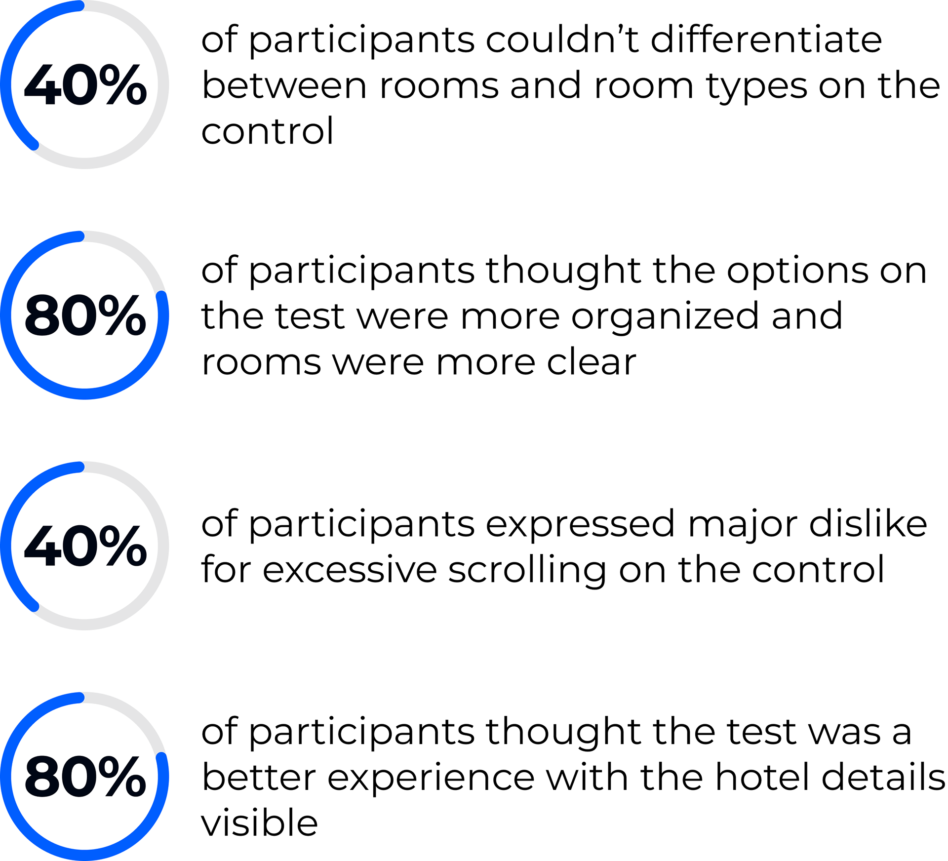
The issues around the room selection experience had been longstanding, and as the organization scaled and continued to acquire more partners, it became a much higher priority with Product & Leadership. Before starting anything, I took the time to audit the existing experience and identify where it fell short.
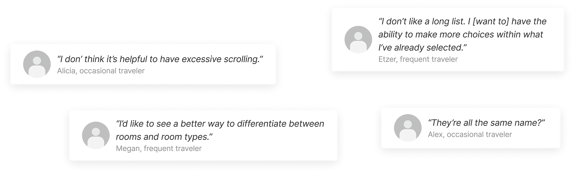
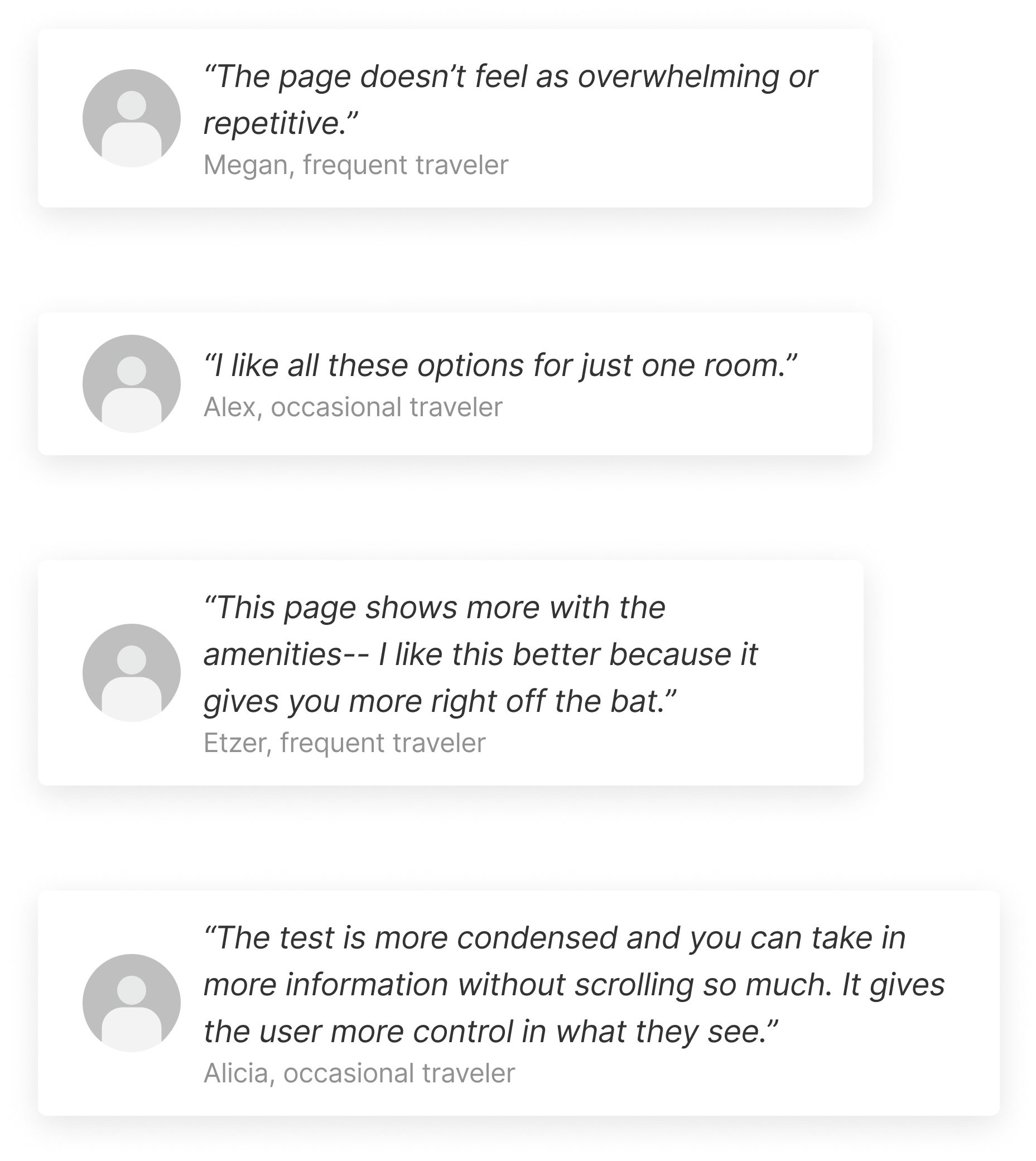
*Some comments we received from users I interviewed
DOOM SCROLLING EXPERIENCE 👎🏽
desktop & mobile hotel cards
hi
Discovery & analysis
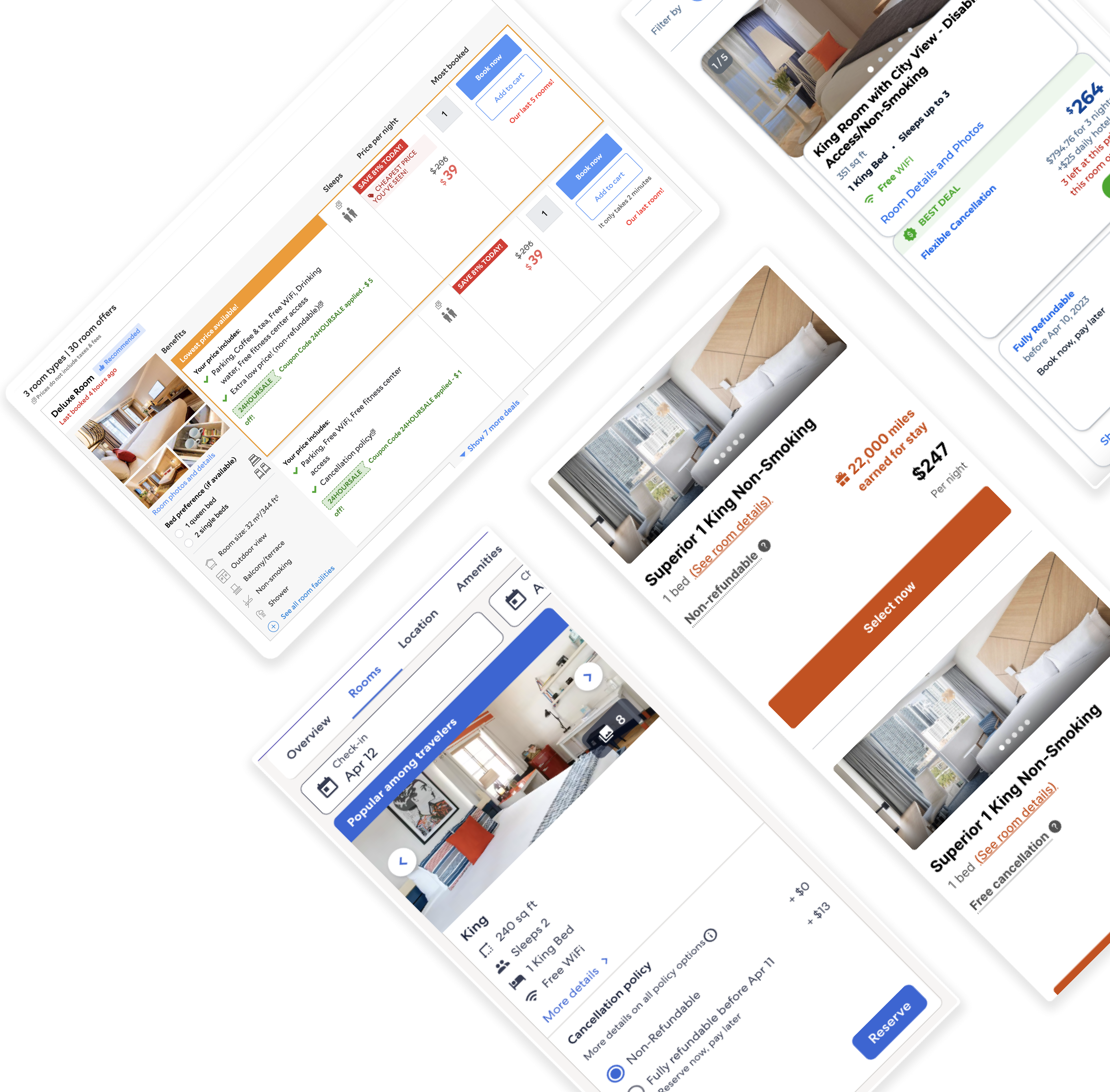
I needed to see how other OTAs approached presenting room offerings, so I took a look at other competitors. All of these sites were different, but had some common patterns: they all had distinct room categories and did a decent job at consolidating a lot of important information on the room cards, making them easy to scan.
User research
A FIRST PASS
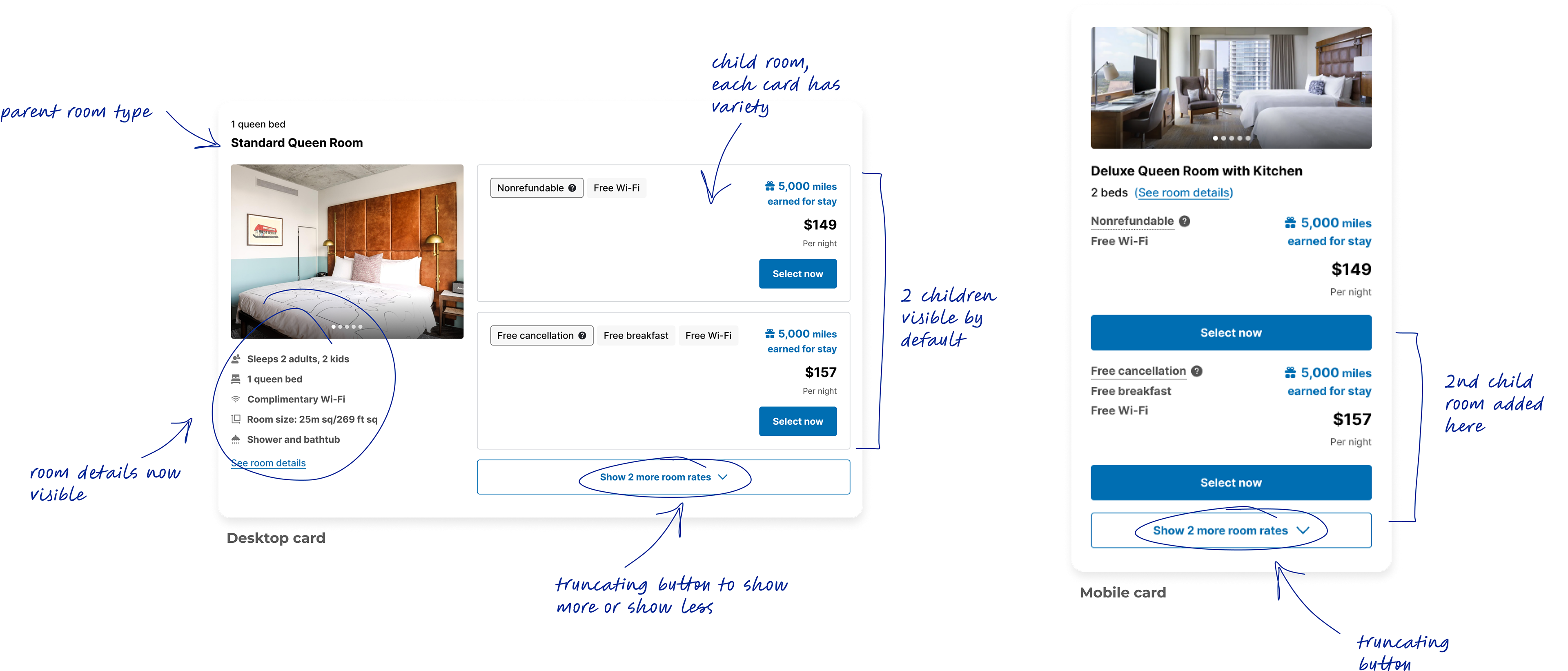
After studying other examples and seeing how Agoda, our parent company, solved for this problem, I attempted a first pass at how this could work. With this iteration, I wanted to focus first on solving for the duplicate rooms and infinite scrolling, so the groupings started to take shape with child rooms getting categorized under parent room types. Any subsequent changes could take place later, but the goal at this stage was to rough out a baseline of the experience, and this felt like a good first step before talking to users.
User impressions & insights
The next phase of this work was to conduct interviews. I recruited a handful of people, ranging from experienced, frequent travelers to those who rarely travel at all. I asked them about what they value and prioritize most when booking travel, their likes and dislikes when it comes to booking a room, their initial impressions on the new designs compared to others and how it measured up to the current experience.
*Complete user impressions linked here
hello
How can we push this further?
User insights helped identify additional considerations to implement:
• emphasize room imagery in a better way
• show a variety in imagery
• have larger images on mobile view
• call more attention to Free cancellation
• be consistent and transparent with price differences (free cancellation, breakfast included, etc.)
• optimize space on mobile
• implement pagination
• show a variety in imagery
• have larger images on mobile view
• call more attention to Free cancellation
• be consistent and transparent with price differences (free cancellation, breakfast included, etc.)
• optimize space on mobile
• implement pagination
I shared all these findings with my PO and other stakeholders, helping determine what changes we’d want to prioritize and defining scope.
Design treatments
NEW ENHANCEMENTS
After multiple rounds of internal review addressing usability and feasibility with product, engineers and fellow designers, I landed on enhancements we felt aligned with the insights users had shared.
Here's what's changed 👇🏽
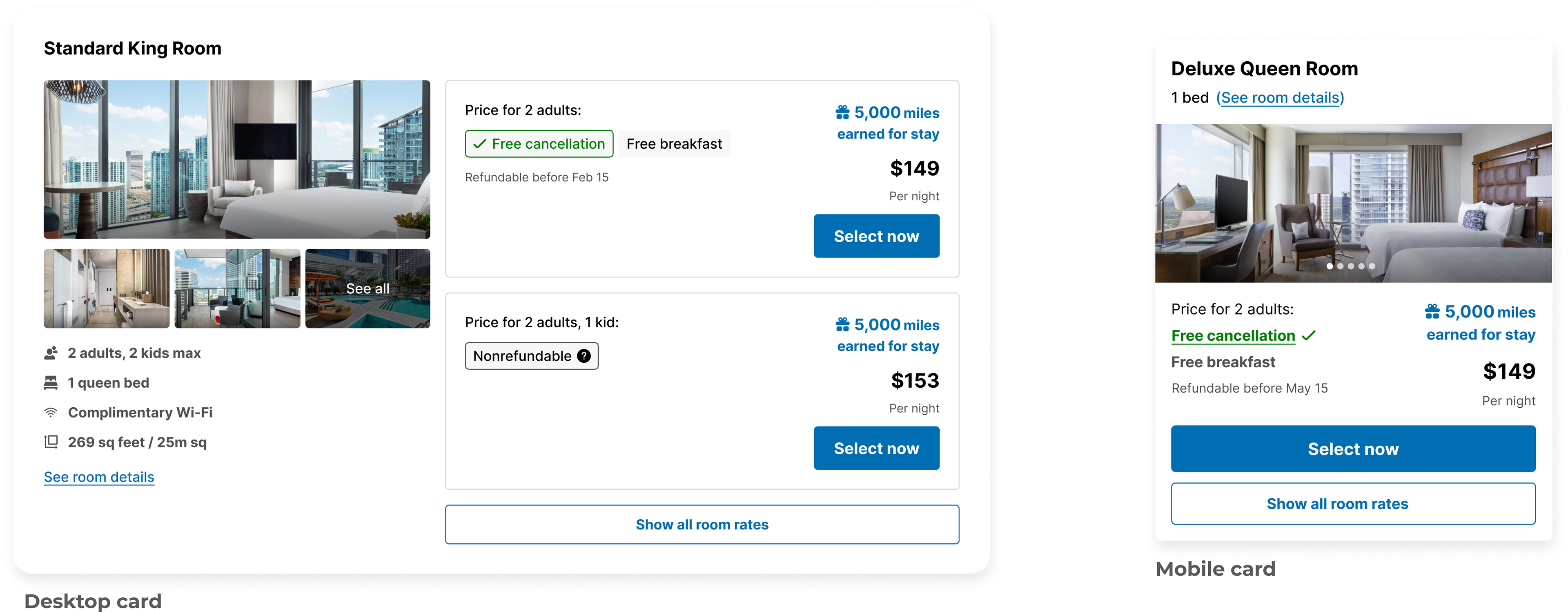
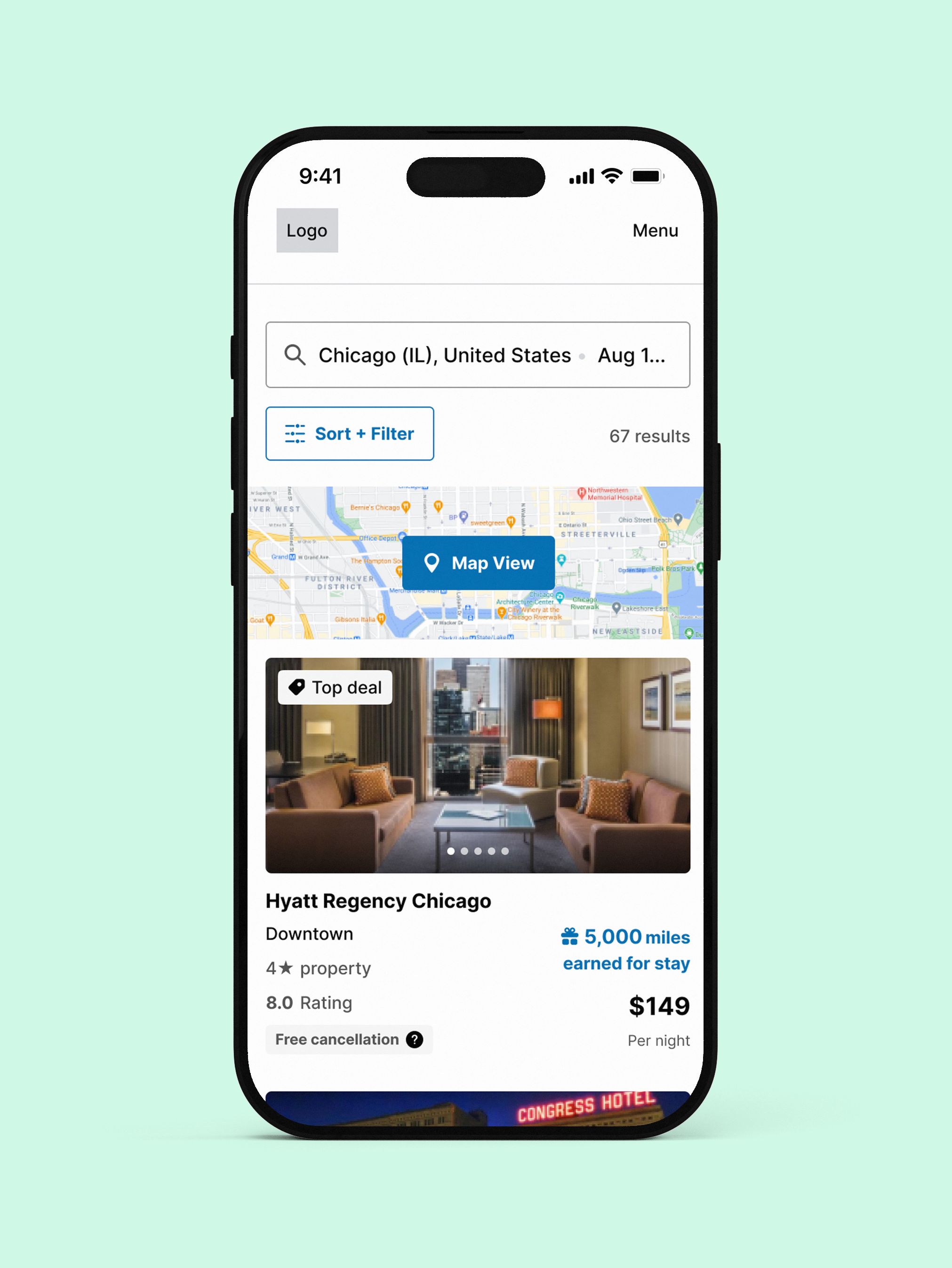
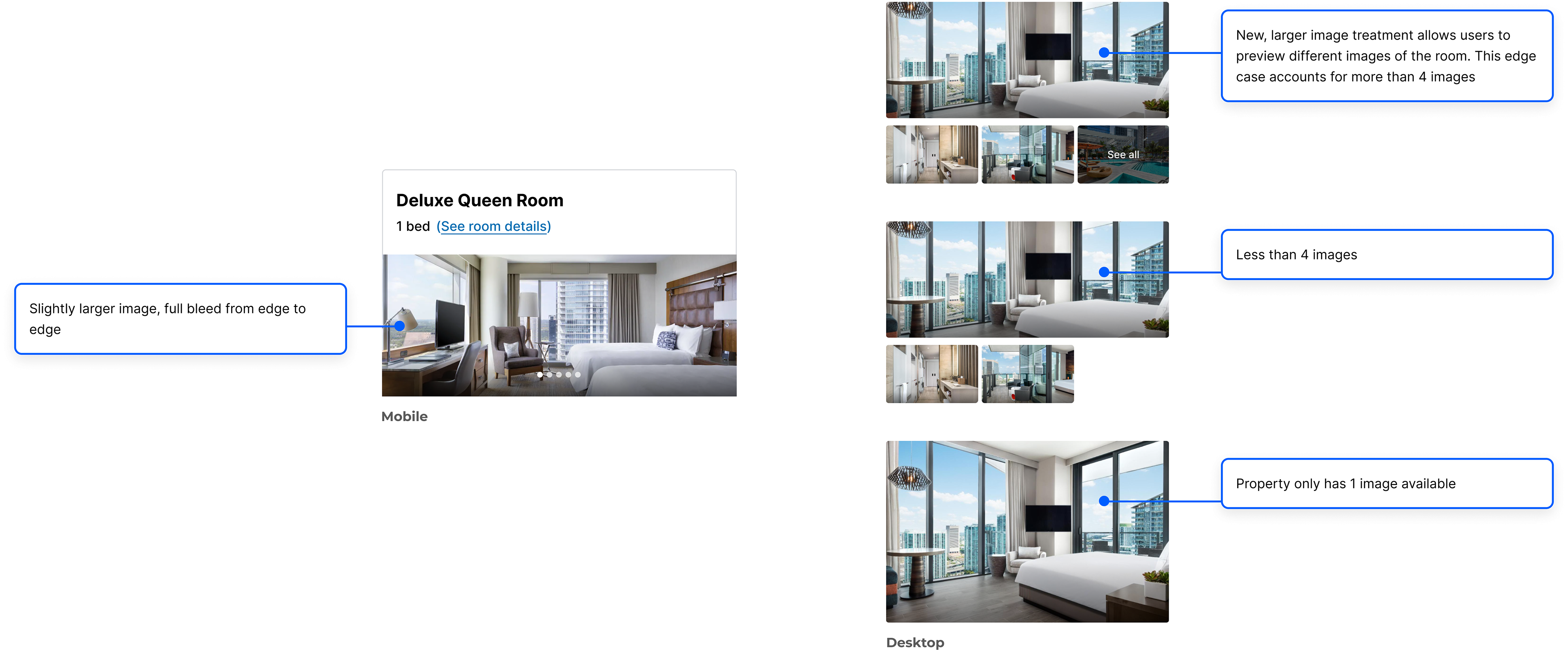
IMAGES & CAROUSELS
Users indicated a desire for larger imagery and image variety, as they needed tasteful visuals to help inform their booking decisions.
hi
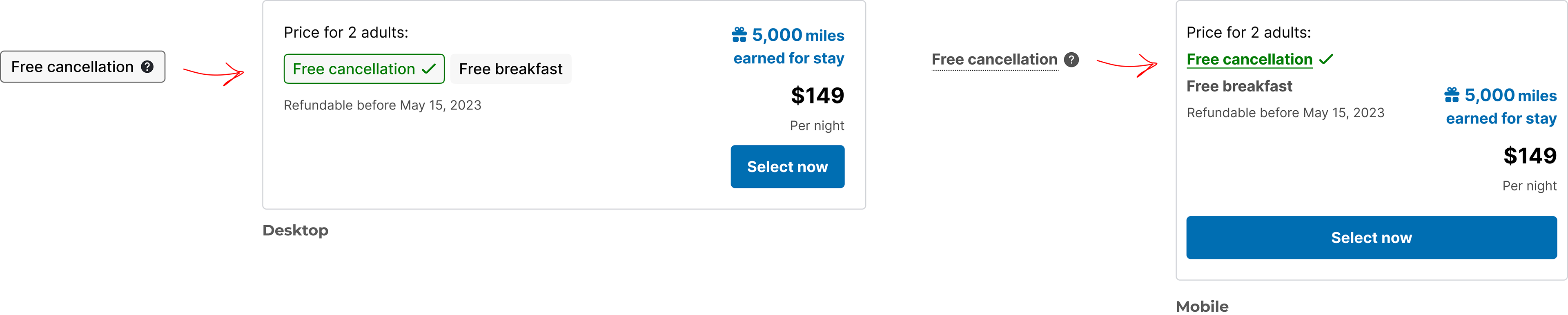
CARD DETAILS
Free cancellation is a big motivator for a lot of users, so I felt it was important to make it stand out more. We also opted to implement a callout for inclusive guest pricing and refundable deadlines for applicable rooms.
hi
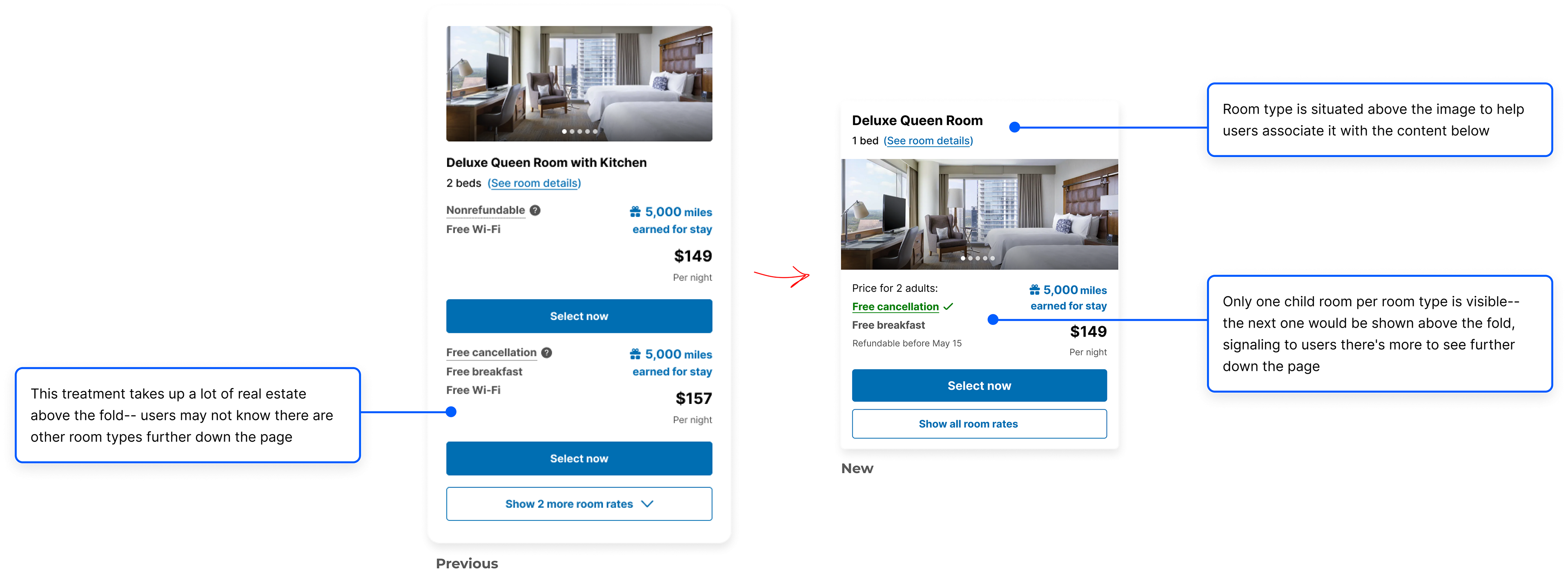
MOBILE GROUPINGS
The previous mobile iterations had 2 child rooms per parent room type, taking up a lot of space.
hi
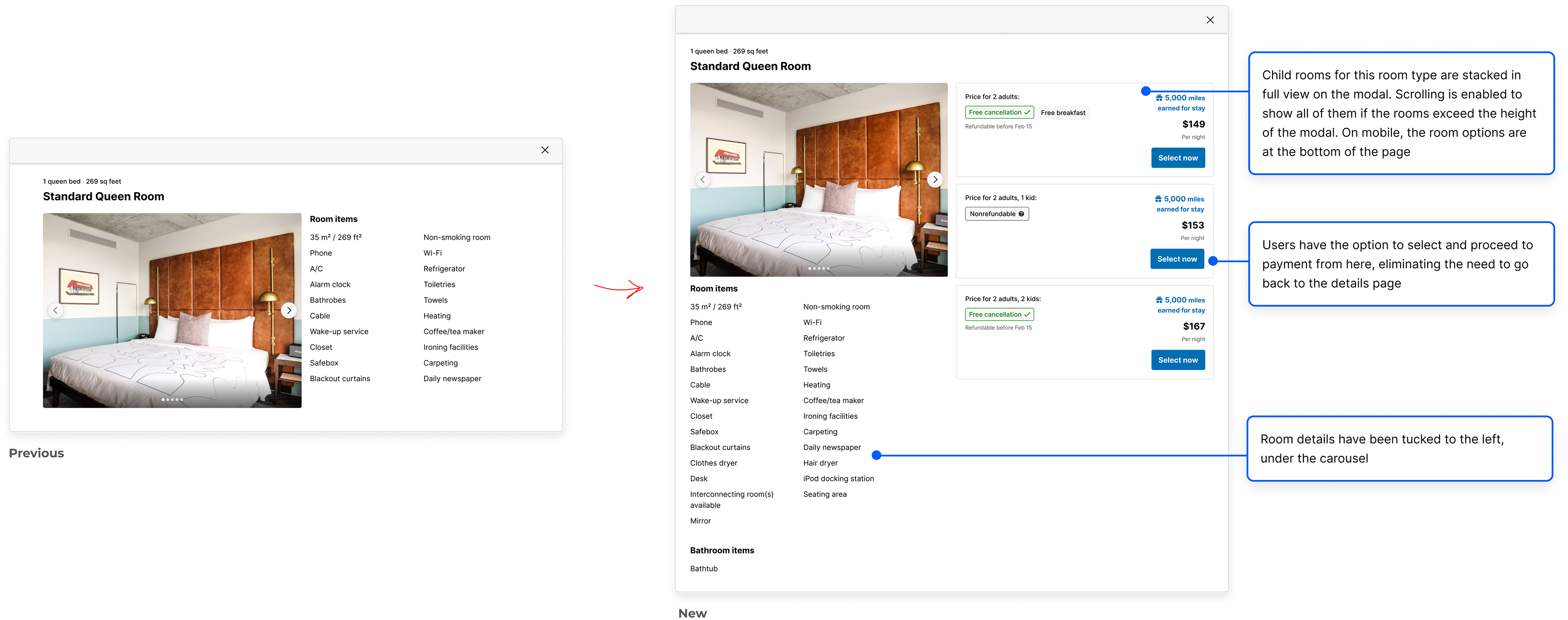
ROOM DETAILS MODAL
Many users prioritize viewing the room details modal to inform their decision. Whereas the previous modal provided imagery and a list of features, I assessed implementing the same enhancements would make using it more valuable.
hi
User validation
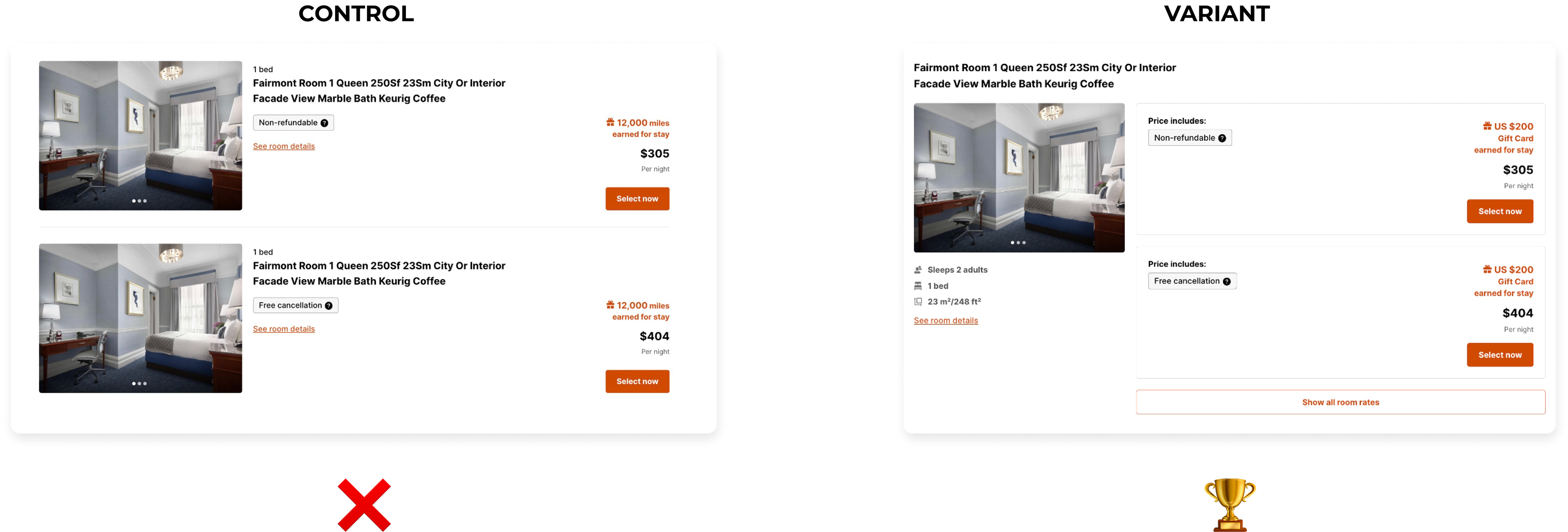
A/B TESTING
We launched a test at 50% on our own platform, Rocketmiles, launching on our remaining partner sites shortly after. Within a few weeks, we were thrilled to see the new variant won against the control! 🎉
Since earn performed well, we kept the groupings live on Rocketmiles. For our other partners with both earn and burn, we turned off the experiment with the intention to introduce new enhancements over time.
Since earn performed well, we kept the groupings live on Rocketmiles. For our other partners with both earn and burn, we turned off the experiment with the intention to introduce new enhancements over time.
Iterations implemented over time
✅ new image treatment on desktop
✅ inclusive guest pricing
✅ updated Free cancellation chip
✅ refundable deadline for applicable rooms
✅ new price-based rewards vs room-based rewards
✅ external bounding box removed
✅ inclusive guest pricing
✅ updated Free cancellation chip
✅ refundable deadline for applicable rooms
✅ new price-based rewards vs room-based rewards
✅ external bounding box removed
hi
Final shipped experience
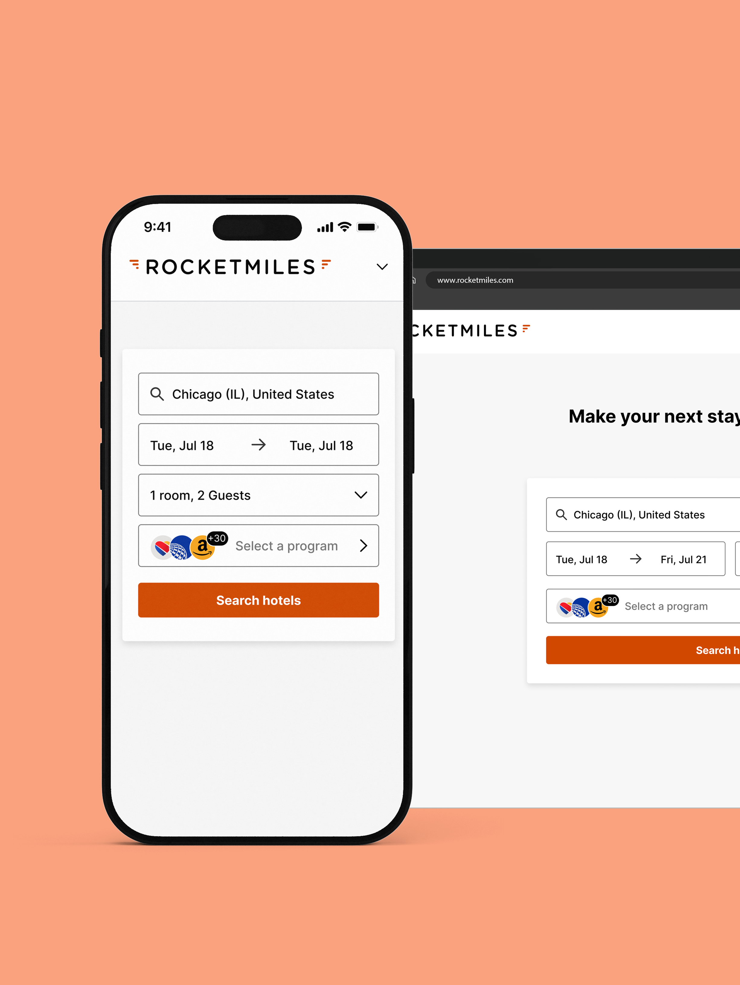
As seen on our partner sites like American Airlines,
Lifemiles, Enrich, Miles & More, Emirates, ConnectMiles and many more.
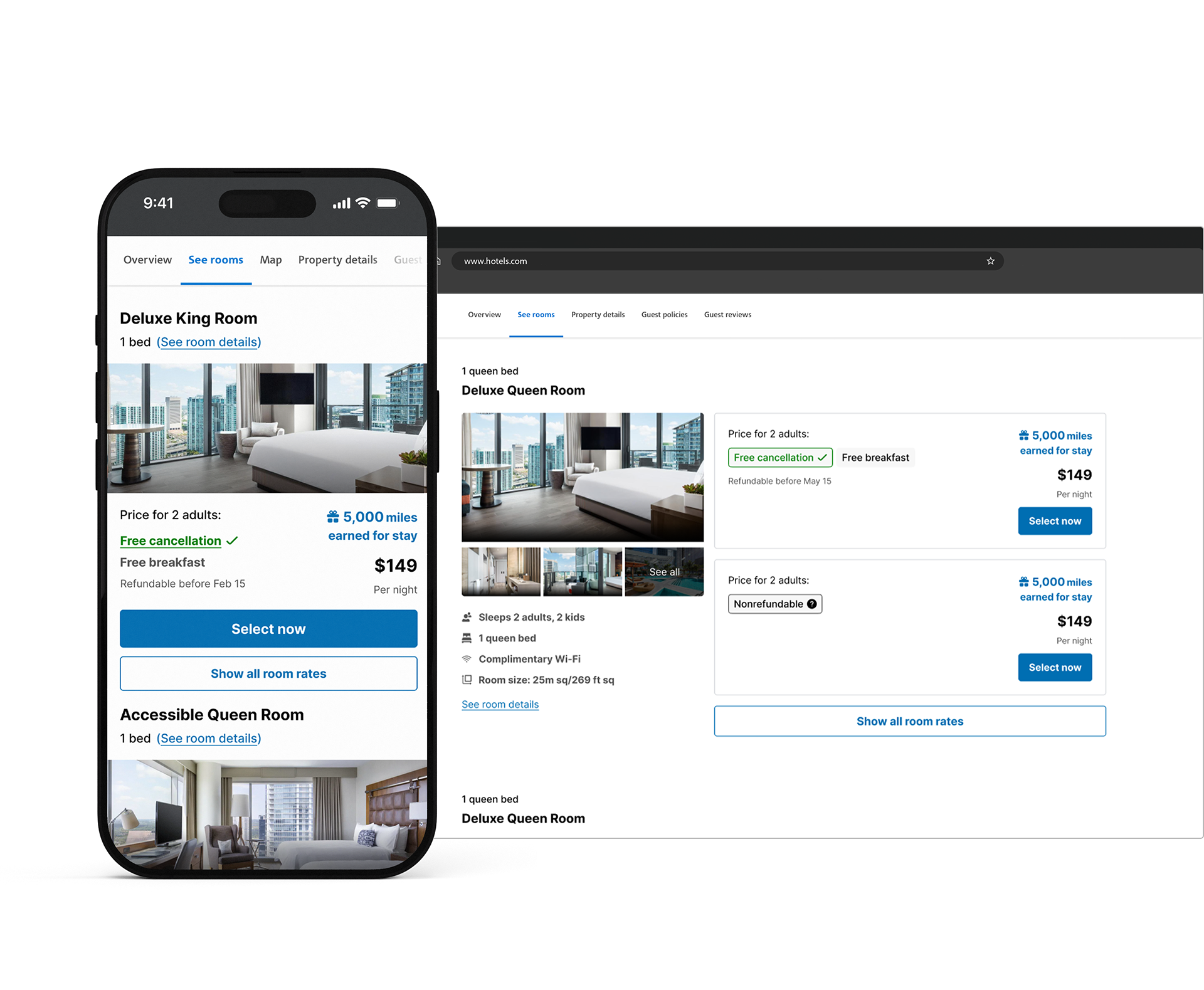
Pictured: live on www.rocketmiles.com
Lifemiles, Enrich, Miles & More, Emirates, ConnectMiles and many more.
Pictured: live on www.rocketmiles.com
Measuring results
The previous room selection experience was less than ideal, and we hoped that by improving the UX, we’d make the process less daunting and direct users to checkout much faster. These changes increased conversion as well as Total True Margin, thus proving our efforts were successful from a user and business perspective.
Key takeaways
Rather than simply executing on design solutions from product, this was an excellent opportunity to really showcase the importance of direct user feedback to inform the improved design of our site.
Additionally, as an organization without a research team at the time, design often conducted their own, so this was a good way for me to actually speak to users and gather valuable insights.
This was also my first time leading a larger project with the support of another designer and a team, so I learned a lot and got to apply these learnings to yield successful results.