OVERVIEW
Roar Bikes is a California based manufacturer of contemporary bicycles. Aside from quality bikes and accessories, they also provide a space for likeminded adventure seekers and casual commuters in the cyclist community to connect. They currently have a few models they're looking to make available for purchase as their product offerings continue to expand.
DELIVERABLES Wireframes, Userflows, High Fidelity Mockups, Design Assets
ROLE Research, Experience Design, Interface Design
TOOLS Adobe XD, Adobe Photoshop, Overflow
DURATION 2020
USER PERSONA
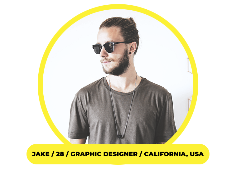
Jake doesn't own a car and rides his bike to get around. He's usually on the go and uses his phone for just about everything.
FRUSTRATIONS He flies through applications to find what he needs, but loses interest or grows annoyed when he's prompted to click through countless menus or gets stuck endlessly scrolling.
NEEDS When looking at bikes and accessories, navigation needs to be simple and easily accessible without him being forced to exit multiple screens and go all the way back where he started.
CHALLENGE How might we improve the shopping experience with an emphasis on speed and ease of use?
SOLUTION An image driven mobile app could be an easy way for users to quickly browse and shop.
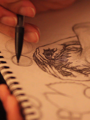
INSPIRATION & SKETCHES
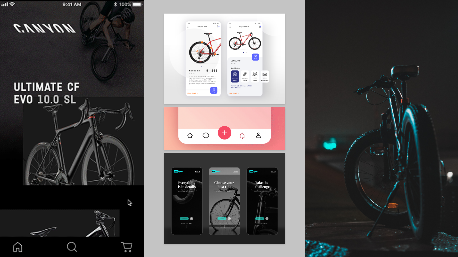

* I like to sketch my initial ideas before development.
Exploring an object that's streamline and edgy set the stage to show a product that's as bold as the ones who ride it. Dark tones and negative space allow stark contrast for the bike to shine and a pop of color gives off some flare. This app needed to reflect a fun, sporty attitude while being all the while concise to keep Jake engaged long enough to use it.
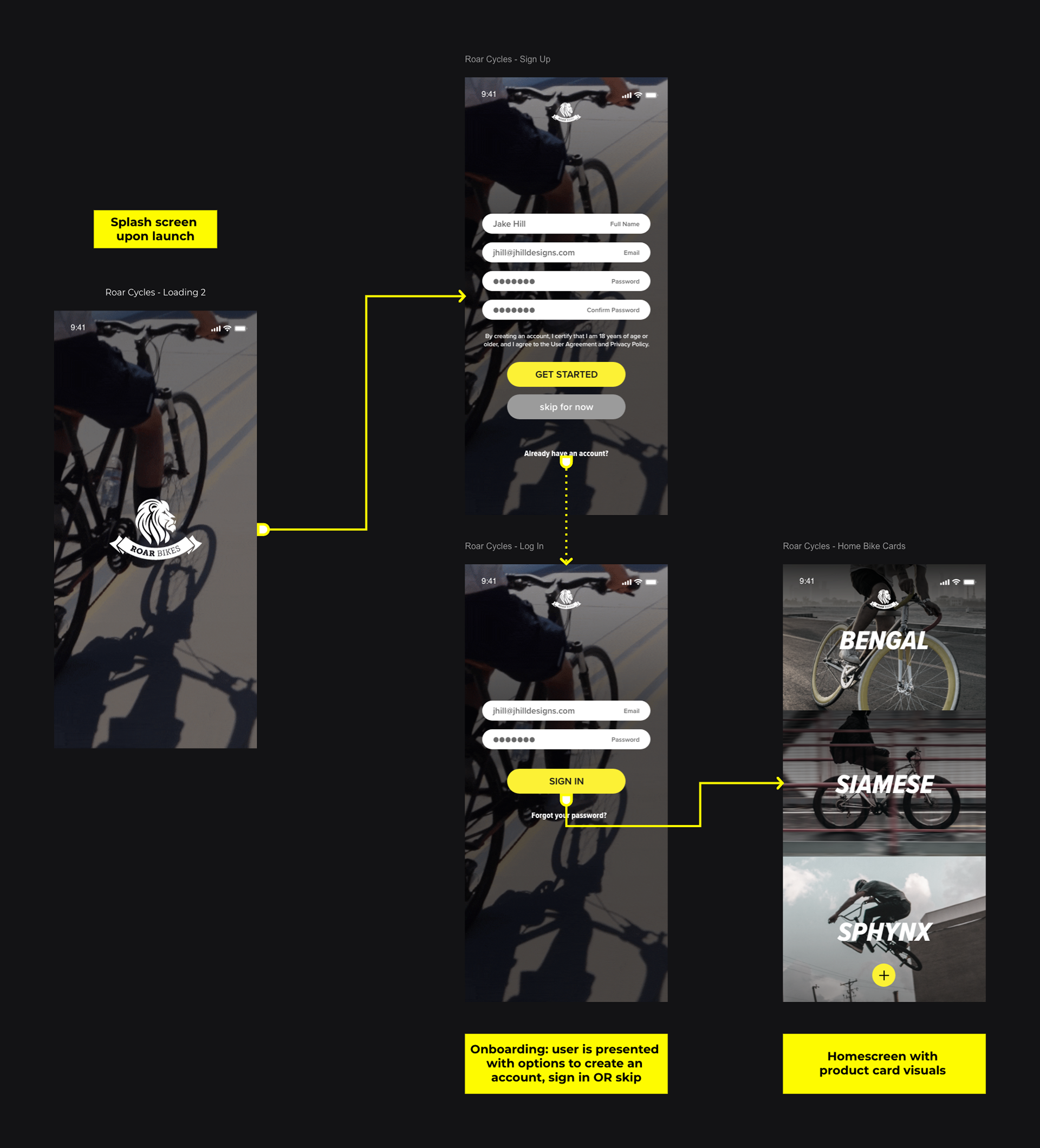
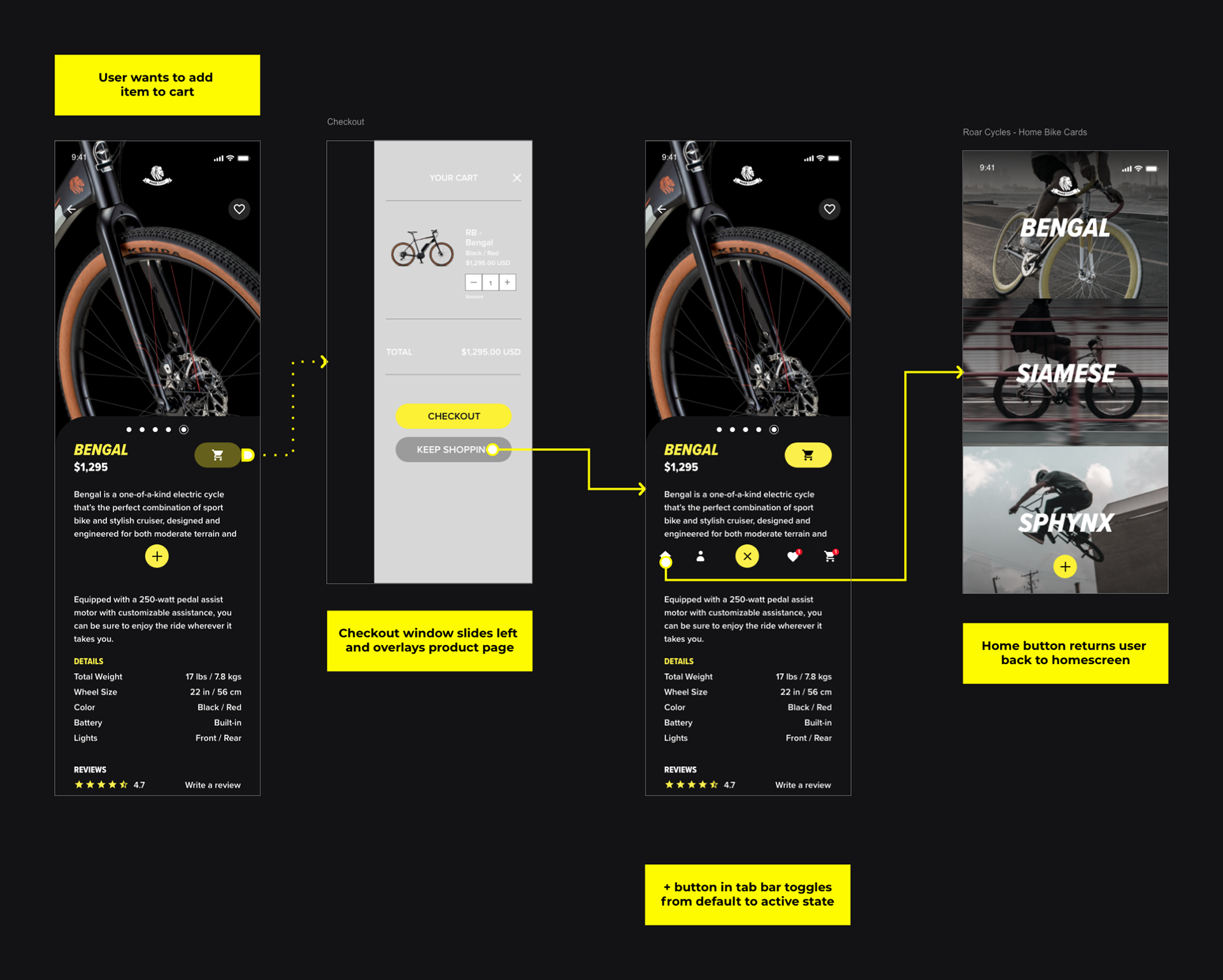
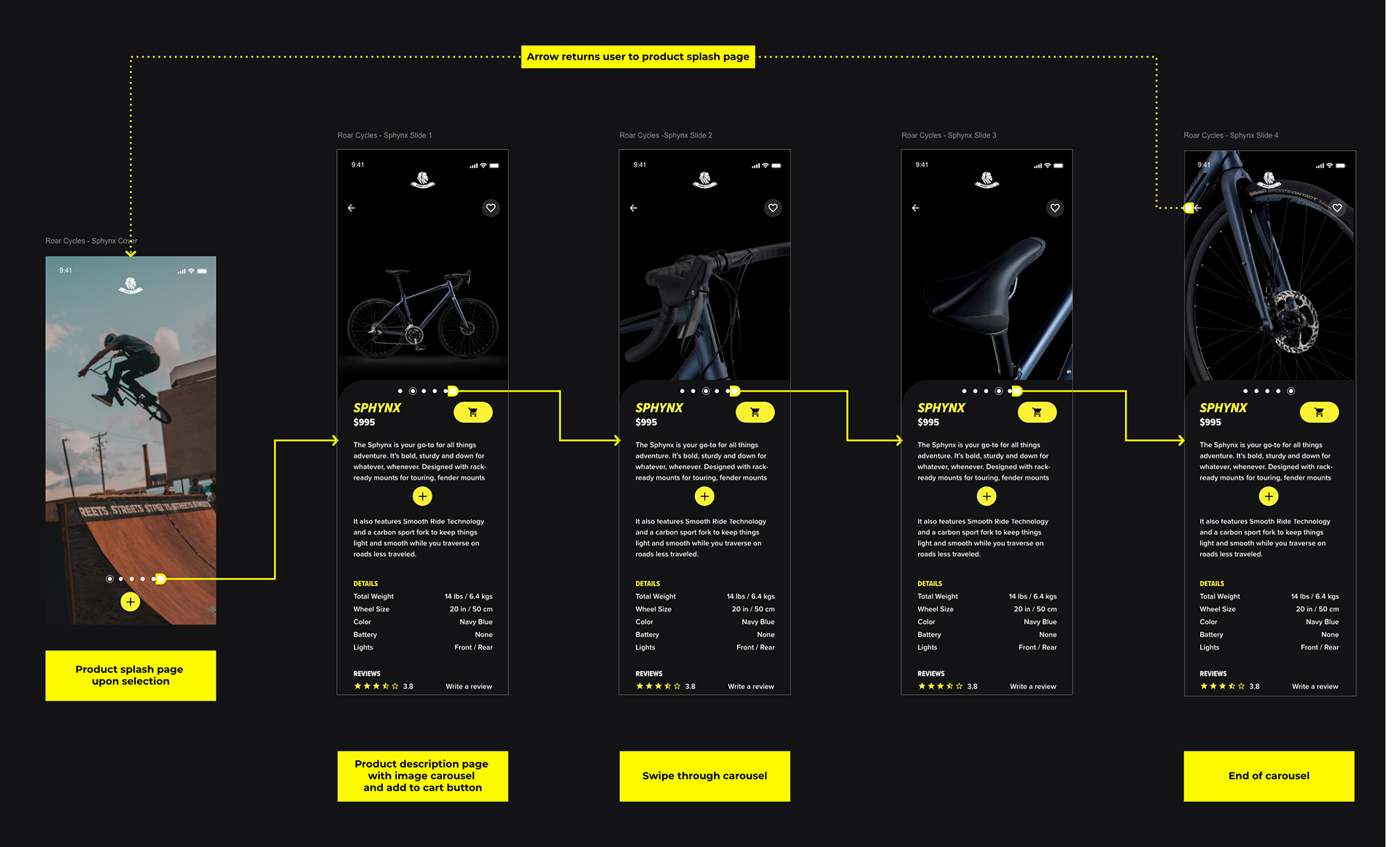
WIREFRAMES
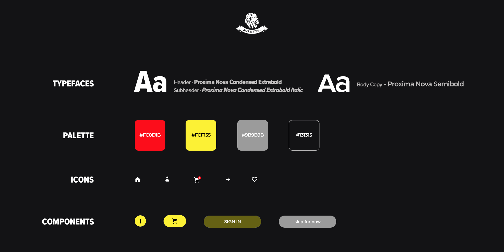
VISUAL IDENTITY
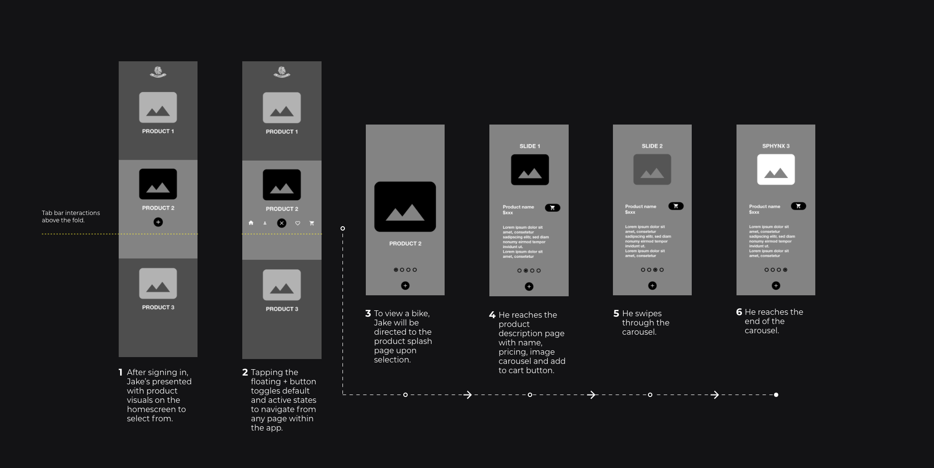
USERFLOWS
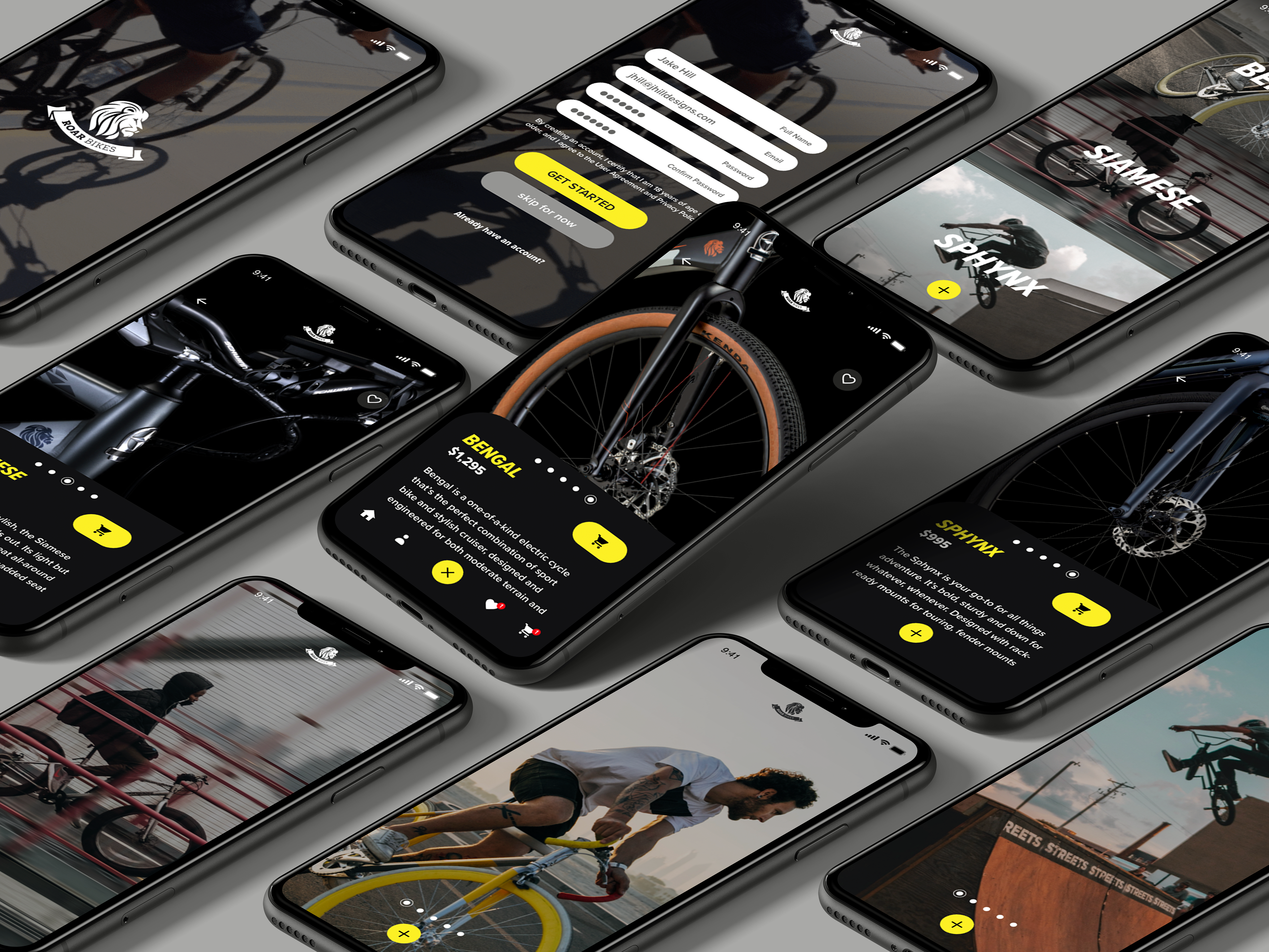
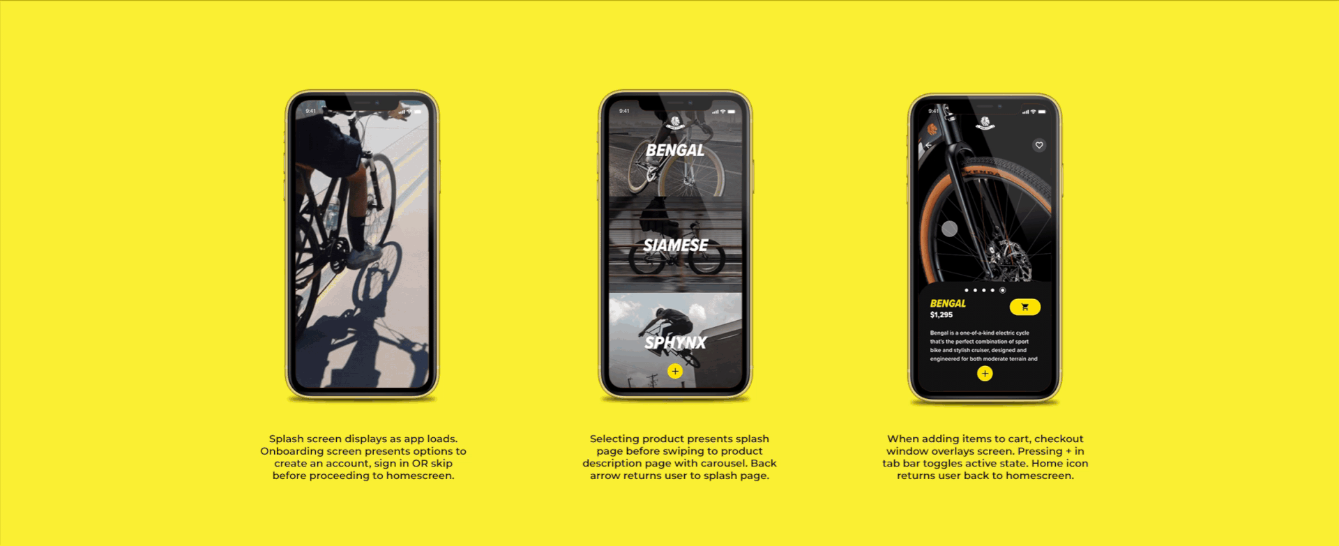
FINAL SCREENS & INTERACTIONS
REFLECTION
CONSIDERATIONS To continue pushing an emphasis on speed, it'd be worth implementing the option to link social accounts as well as facial recognition and finger ID for faster sign in. Devices would vary, but allowing Jake to get in without having to type in his password saves him time.
TAKEAWAYS I would've liked to test my design assumptions. In this instance, Jake's lessened his time searching for products, the visuals make good use of screen real estate, and text is applied only where necessary. But how does that hold when more products are added over time? And more importantly, how can we get him to come back? After completing this project, I'd have liked to conduct proper usability testing through different phases of product rollout to see if users like Jake would still find value in an app that steadily takes longer to use.
In hindsight, I've realized that expectations change as products change and there has to be a clear end goal. These insights were quite eye opening for real life projects and I'm looking forward to applying them in the future.