SORT/MAP/FILTER OPTIMIZATION CASE STUDY
Project overview
I redesigned the way users access sort, maps and filtering functions across Rocket Travel sites. Rocket Travel by Agoda is an online travel agency specializing in building customized white label booking platforms for its many enterprise-level partners and their customers. The goal was to make these functions more obvious, thus making it easier for users to access them from anywhere when they were browsing hotel options.
PROBLEM
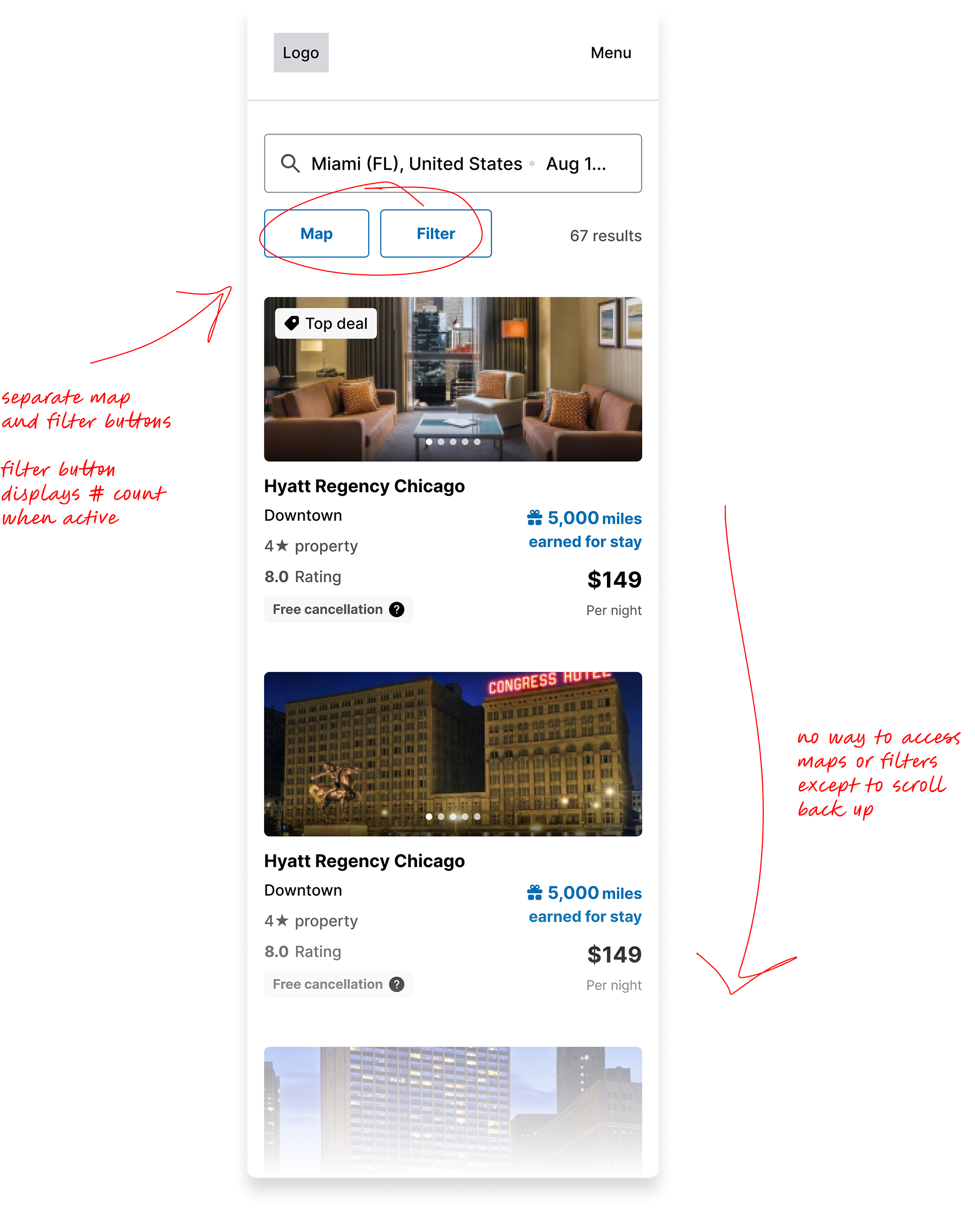
During user testing, we realized mobile users were overlooking or having difficulty finding the sort/map/filtering functionalities on the search results page; these functions only existed at the top, so they got lost once someone started scrolling. This was especially bad for our white label partners with primarily mobile customers.
During user testing, we realized mobile users were overlooking or having difficulty finding the sort/map/filtering functionalities on the search results page; these functions only existed at the top, so they got lost once someone started scrolling. This was especially bad for our white label partners with primarily mobile customers.
SOLUTION
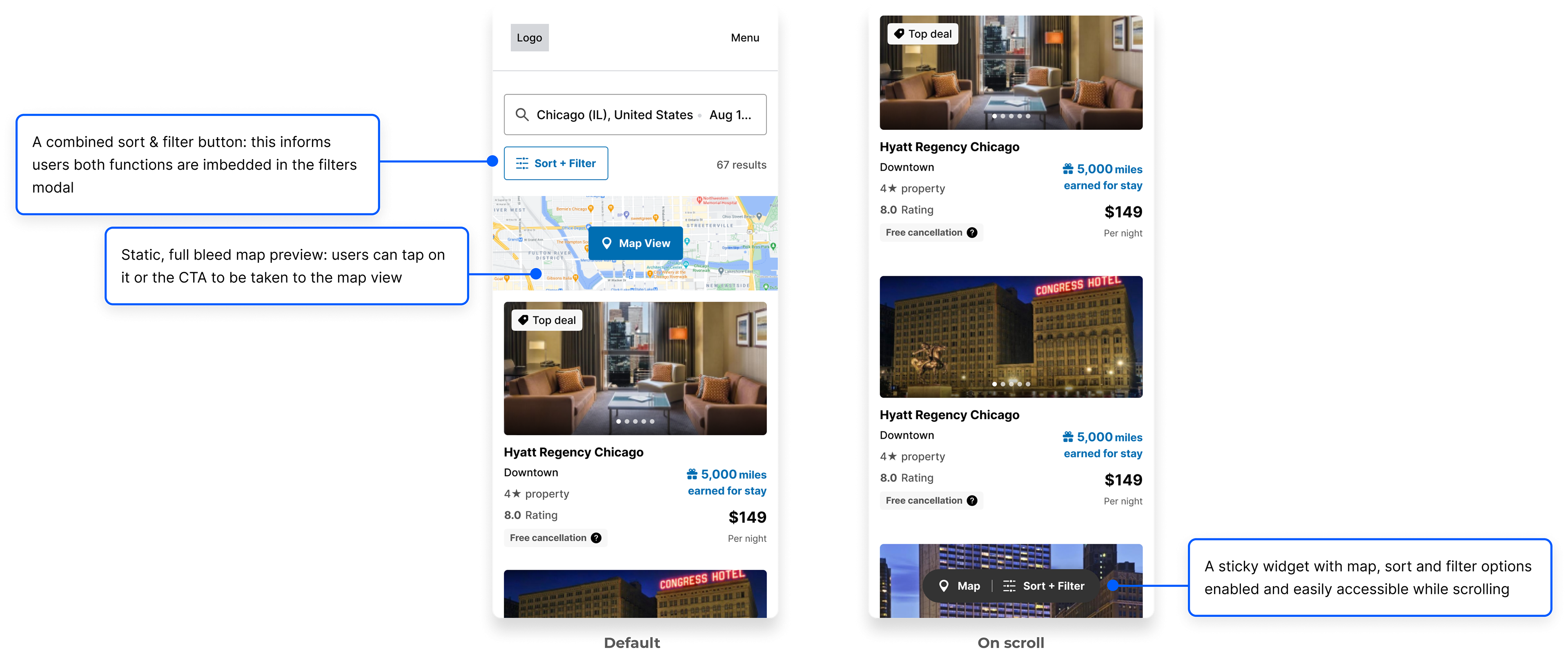
After observing other sites and assessing user feedback, my team and I collaborated to implement a multi-functional sticky widget at the bottom of the screen so the functions were readily accessible when scrolling. I also elected to change the simple Map button at the top of the page for a static image preview that was a lot more conspicuous.
After observing other sites and assessing user feedback, my team and I collaborated to implement a multi-functional sticky widget at the bottom of the screen so the functions were readily accessible when scrolling. I also elected to change the simple Map button at the top of the page for a static image preview that was a lot more conspicuous.
ROLE
Experience Designer
1 Product Owner, a small group of developers, 1 Design mentor
IMPACT
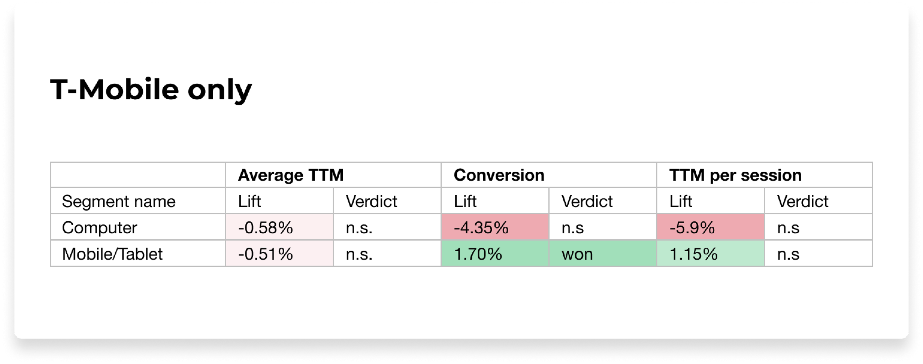
📈 1.7% increase in overall Conversion
📈 1.15% lift in Total True Margin for T-Mobile
PROCESS
Discovery, User Surveys, UX Design, Interaction Design, A/B Testing, Dev Hand-off
DURATION
2023
STATUS
Live
These changes were especially significant for one of our largest partners, T-Mobile, where over 95% of their customers were mobile users. We saw a 1.7% increase in conversion along with a 1.15% lift in Total True Margin per session.
Discovery
OUT WITH THE OLD (UX) 👎🏽
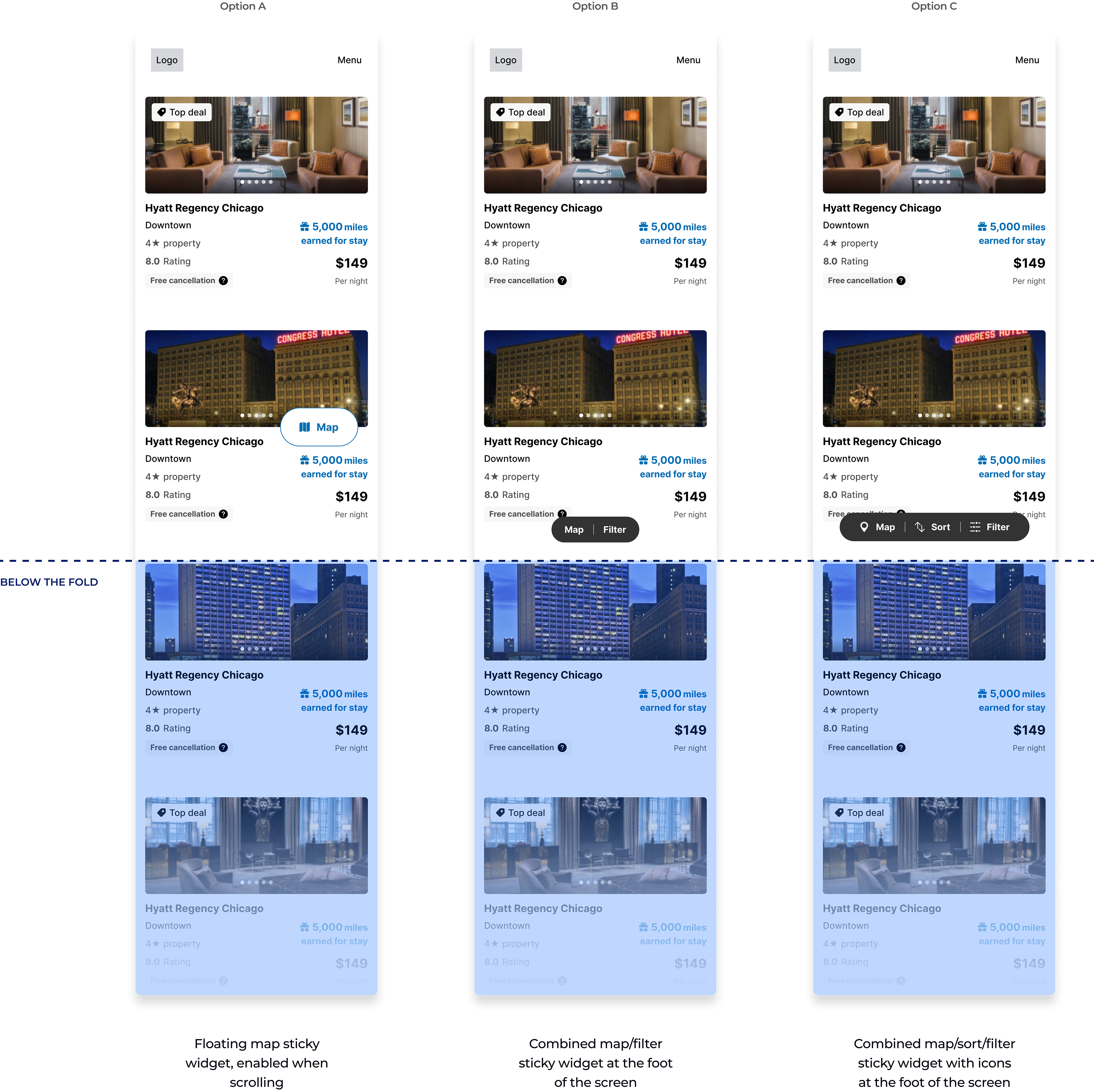
On the search results page, the map and filter buttons sat under the search bar at the top, but easily got lost once the user started scrolling. Additionally, sorting was embedded into filtering, so it wasn’t the easiest to find.
Discovery & analysis
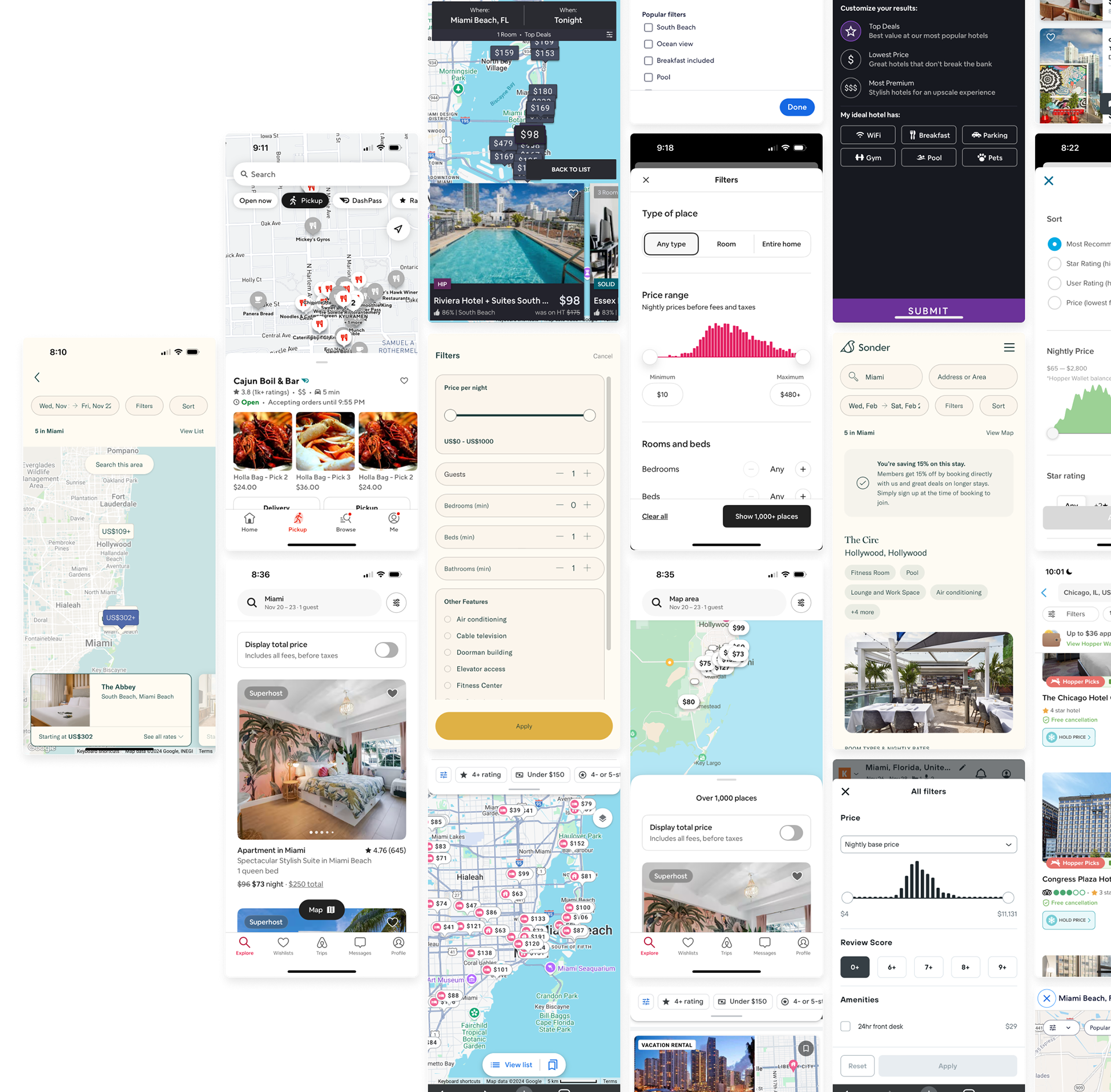
I wanted to take a look at how online travel competitors and different brands incorporated sorting, maps and filtering into their mobile experiences to identify common design patterns and see how they solved for easy access of these functions.
hi
User Research
User surveys & insights
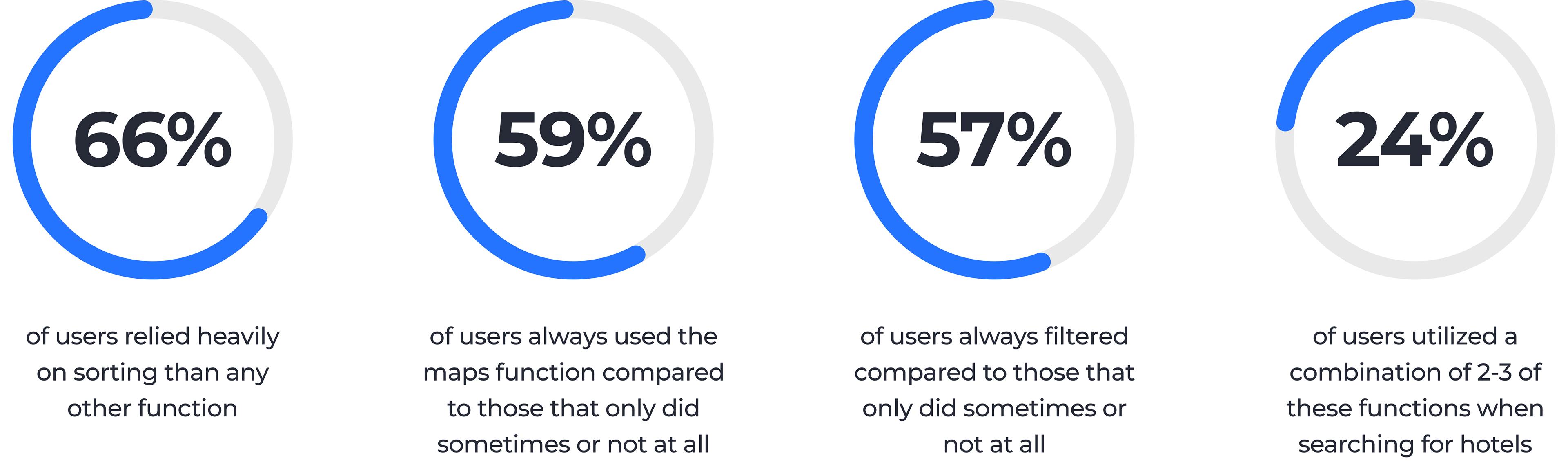
In order to design a better experience, I also needed to understand how our users prioritized and utilized these functionalities when they searched for hotels. With the help of our Senior Researcher, I sent out a survey to our Rocket Insiders, an exclusive group of our own customers, 96 of who responded.
I got some interesting responses from our participants, and these insights helped me identify how much these functionalities are valued, why and how often they're used based on priority.
*Full survey synthesis linked here
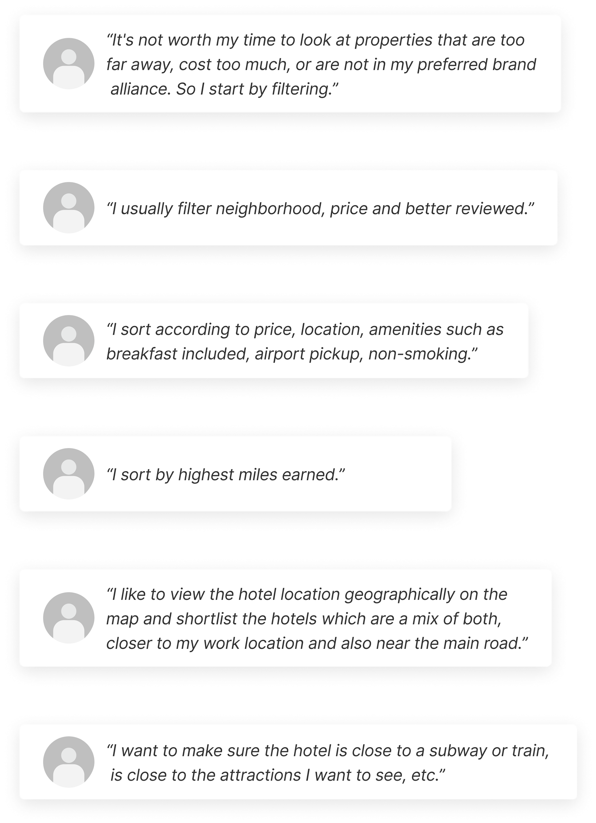
What can we improve?
SORT / FILTER
• make the sort feature more obvious (currently hard to find)
• make sort and filter functions easily accessible from anywhere on the page while scrolling
MAP
• emphasize the map (it’s easily missed in current UX)
• make the map easily accessible from anywhere on the page while scrolling
• make the sort feature more obvious (currently hard to find)
• make sort and filter functions easily accessible from anywhere on the page while scrolling
MAP
• emphasize the map (it’s easily missed in current UX)
• make the map easily accessible from anywhere on the page while scrolling
These findings indicated what our users wanted and I was was able to easily get buy-in from my team.
Design treatments
After looking at online OTAs and food delivery experiences, I tried a few different approaches taken from similar patterns I observed. Based on survey responses, I wanted to make sure I was considering what users are most familiar with.
SORT, MAP & FILTERING
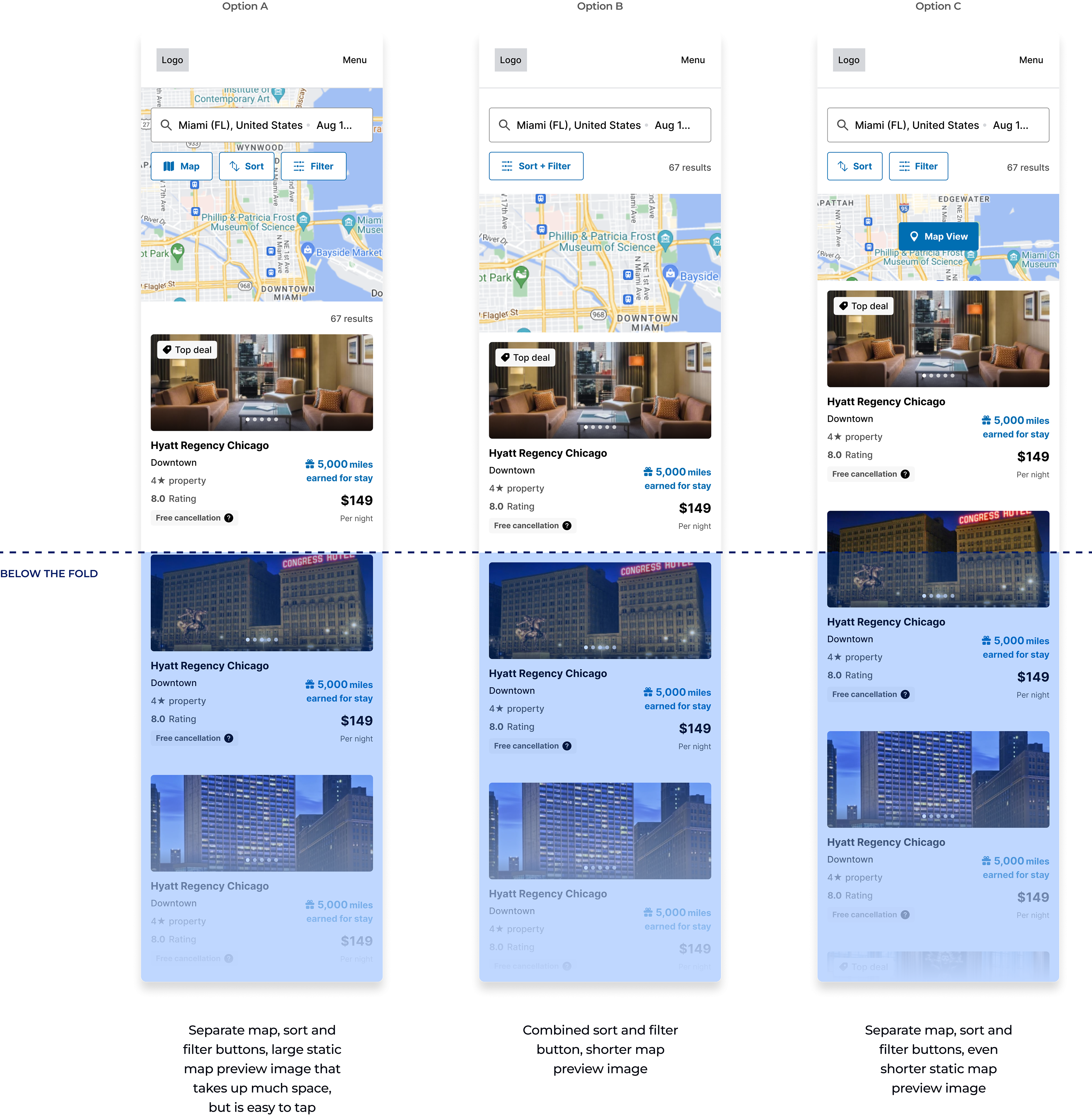
ACCESSIBILITY ON SCROLL
FINAL DESIGNS
After multiple rounds of internal review and combining different ideas together, we opted for this design iteration:
User validation
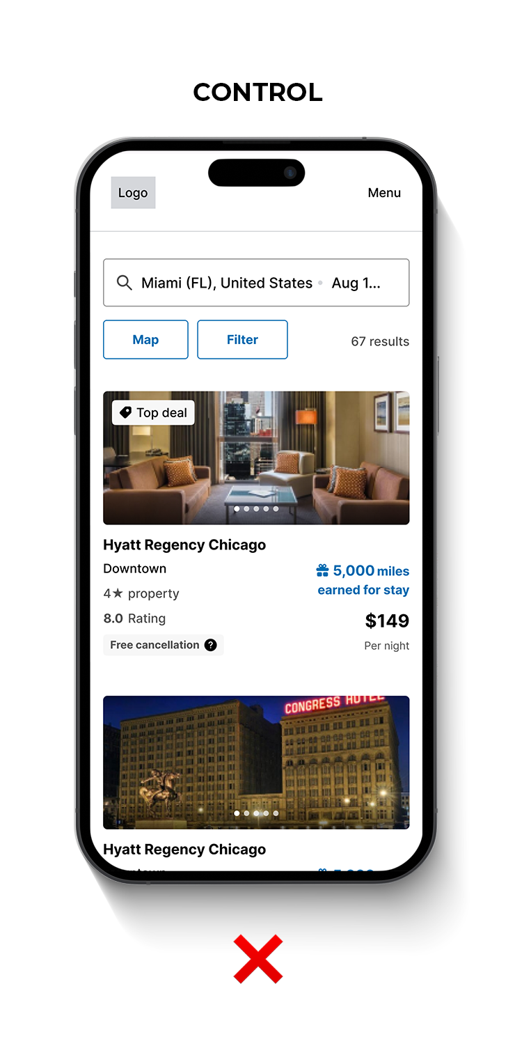
TESTING
In the QA phase of these new improvements, we performed a smoke test to make sure there were no critical issues with the fundamental features. Afterwards, we felt confident in conducting an A/B test against the control. The new variant won.
RESULTS
The results of our test were promising…but a bit skewed. This was a purely mobile experience, primarily meant for our T-Mobile customers. Due to unforeseen technicalities, our experiment was set up to record desktop sessions as well. Desktop performed poorly of course, but the numbers we tracked for mobile weren’t the most accurate or significant, even if they were positive.
Final shipped experience
The intent was to make these functions more obvious and accessible, enabling users to find their desired hotels much faster. We strongly felt that the newer designs provided a much better UX, regardless of the skewed results. Therefore, we proceeded with launching the variant as the default experience on our site and across our white label partners like American Airlines, Flying Blue, Emirates and many others.
Minor tweak: Map CTA was changed from Map View to Show on map, and icon was removed.
Pictured: live on aadvantagehotels.com
Minor tweak: Map CTA was changed from Map View to Show on map, and icon was removed.
Pictured: live on aadvantagehotels.com
Outcomes
The combined sort/filter button, static map preview and sticky widget were successfully implemented on mobile across all partner sites, garnering the most significant conversion from T-Mobile customers.
Key takeaways
Solving for this allowed me to dive deeper into user behaviors and preferences around our booking platform while also utilizing design patterns that are both common and familiar. I was very surprised by the different ways users use these functions, particularly sorting, and it made me realize we should opt to make it more prominent.
At one point during exploration, I’d proposed a conversation around a more straightforward sort function that wasn’t combined with filtering. This function could live on the search results page, but this proved to be way out of scope, so we focused more on a solution that was low-lift, high impact, resulting in a combined sort/filter button with fewer support tickets.
At one point during exploration, I’d proposed a conversation around a more straightforward sort function that wasn’t combined with filtering. This function could live on the search results page, but this proved to be way out of scope, so we focused more on a solution that was low-lift, high impact, resulting in a combined sort/filter button with fewer support tickets.
However, my PO and I agreed to revisit future iterations where sorting lived separately on the search results page, allowing users to interact with it there rather than in the filters modal.