OVERVIEW
Maynooth Furniture is entering the online furniture manufacturing space. They offer quality design furnishings and home goods produced in Ireland. Because they work directly with craftsmen, designers and suppliers, they can produce and sell goods at a reasonable price without the middleman. This helps distinguish their brand as one that delivers on their promise of quality while standing amongst giants in a thriving industry.
DELIVERABLES Wireframes, Userflows, High Fidelity Mockups, Design Assets
ROLE Research, Experience Design, Interface Design
TOOLS Adobe XD, Adobe Photoshop, Overflow
DURATION 2020
USER PERSONA
Katherine is an empty nester and now has space to complete home projects. With remodeling complete, it's time to update her furniture.
FRUSTRATIONS She's taken to browsing Pinterest and We Heart It to get design ideas, but she doesn't have time to scour the internet, and she doesn't always remember to reference where she found things-- hence why she still hasn't started shopping.
NEEDS Furnishing your home can be a daunting task, so she'd like a means to do so that won't feel intimidating and overwhelming.
CHALLENGE How might we improve the process of shopping online with an emphasis on customer engagement?
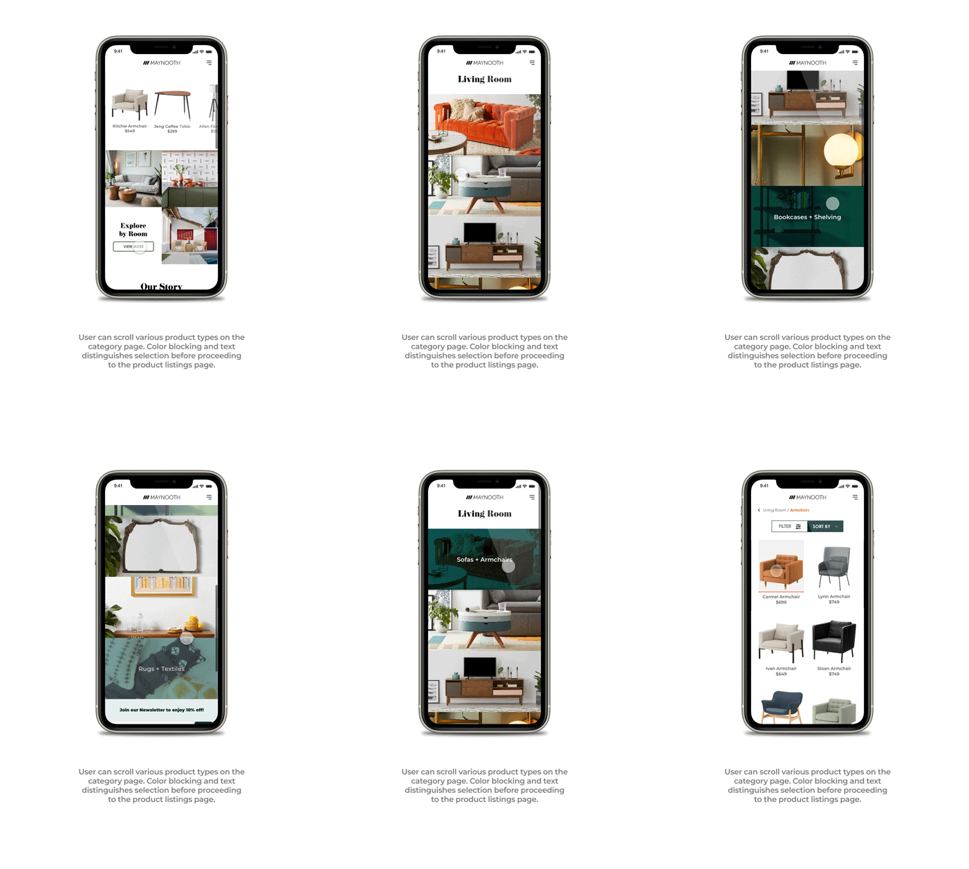
SOLUTION A gallery heavy e-commerce site with warm tones, color blocking, large imagery and plenty of white space will be inviting and make browsing collections a lot more enjoyable.
INSPIRATION & SKETCHES
* Some preliminary sketches.
Plants and natural light literally brighten any living space. Earth tones are calming and relaxing, while vibrant colors are refreshing. It was important to showcase this with various furniture styles, patterns and textures and to balance it out with plenty of negative space. This site had to be fresh and inviting so Katherine would be excited to spend time on it.
WIREFRAMES
VISUAL IDENTITY
USERFLOWS
FINAL SCREENS & INTERACTIONS
REFLECTION
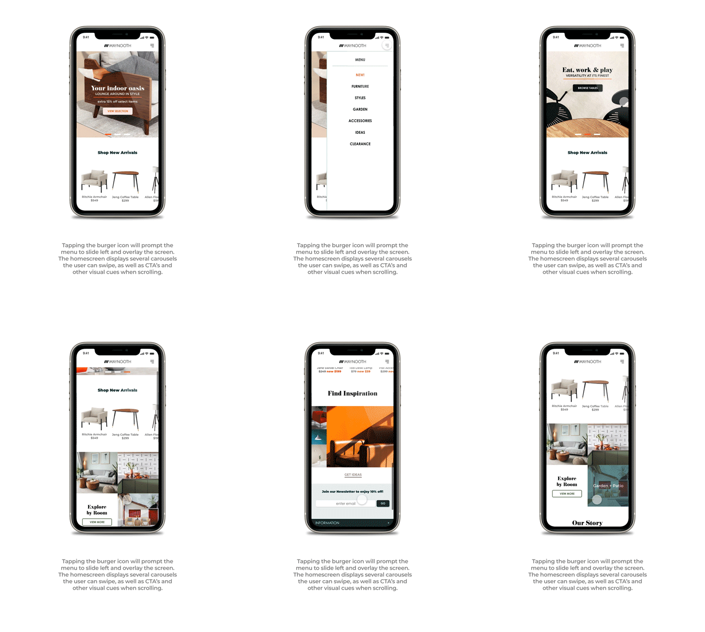
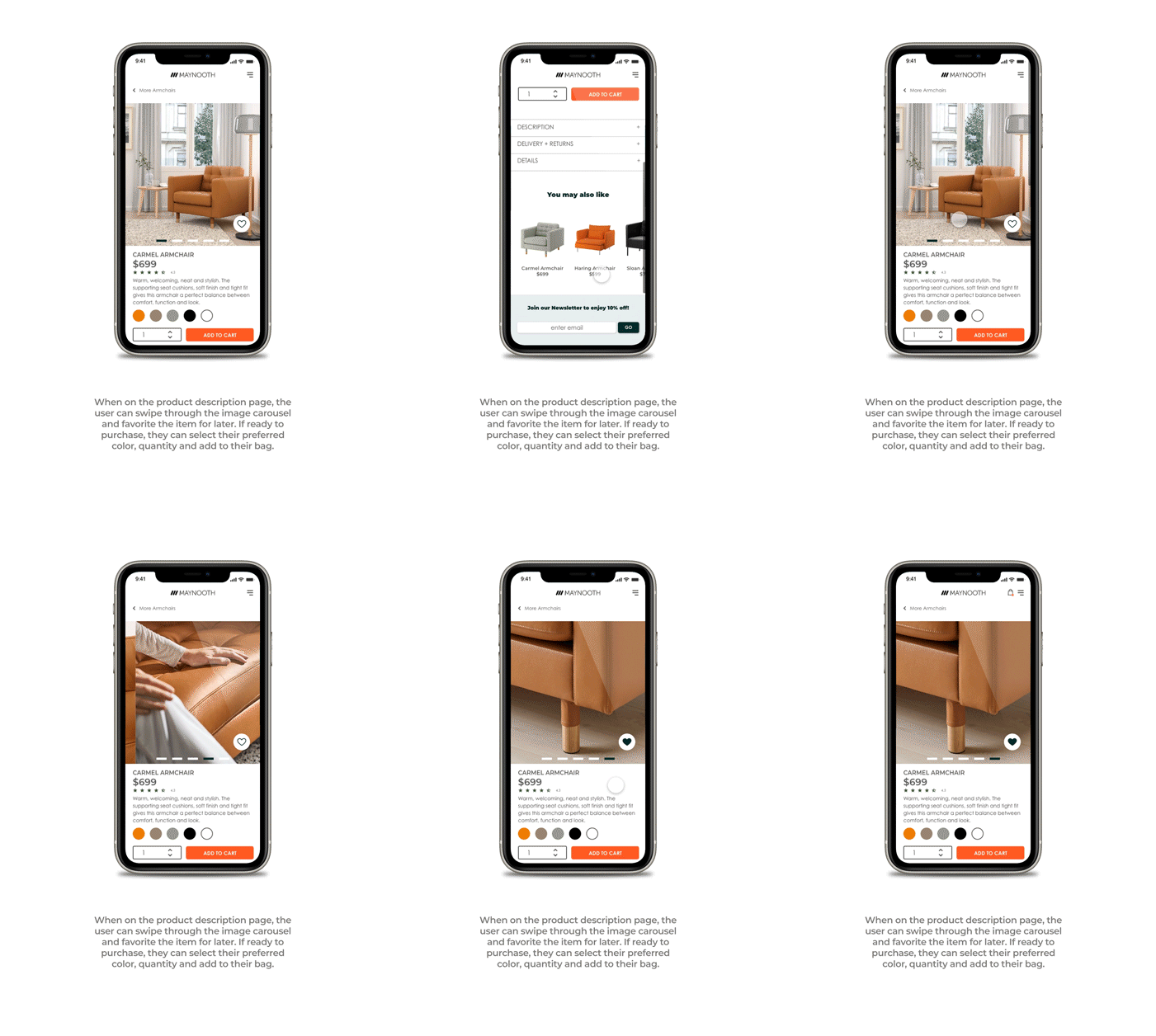
There are multiple carousels and galleries to keep Katherine engaged throughout the site; there are even two above the fold when she visits the landing page on her mobile device, so encouraging her to interact from the very beginning is a good start to get her attention.
CONSIDERATIONS Now, to keep her attention, I think personalizing her experience with quizzes could be useful in determining her interior design style (e.g. traditional, contemporary, minimalist, etc.) to help her better understand what she likes. Also, fleshing out the Find Inspiration section to include an explore feature similar to Pinterest or Instagram would give her more value.
TAKEAWAYS I understand furniture shopping is a process, therefore it's not realistic for anyone of any age to bang it out in one go. Even if people like Katherine take their time to fully furnish every room, the goal was to provide a means for them to do so confidently at their own pace. In the end, a product that works for Katherine will easily work for other users.

